It’s time for us to commit to a tile layout because the kitchen floor is finally happening! We’ve been walking on subfloor for weeks (months?), but Wyatt is laying the cement board this week, and then we’ll be ready tile.
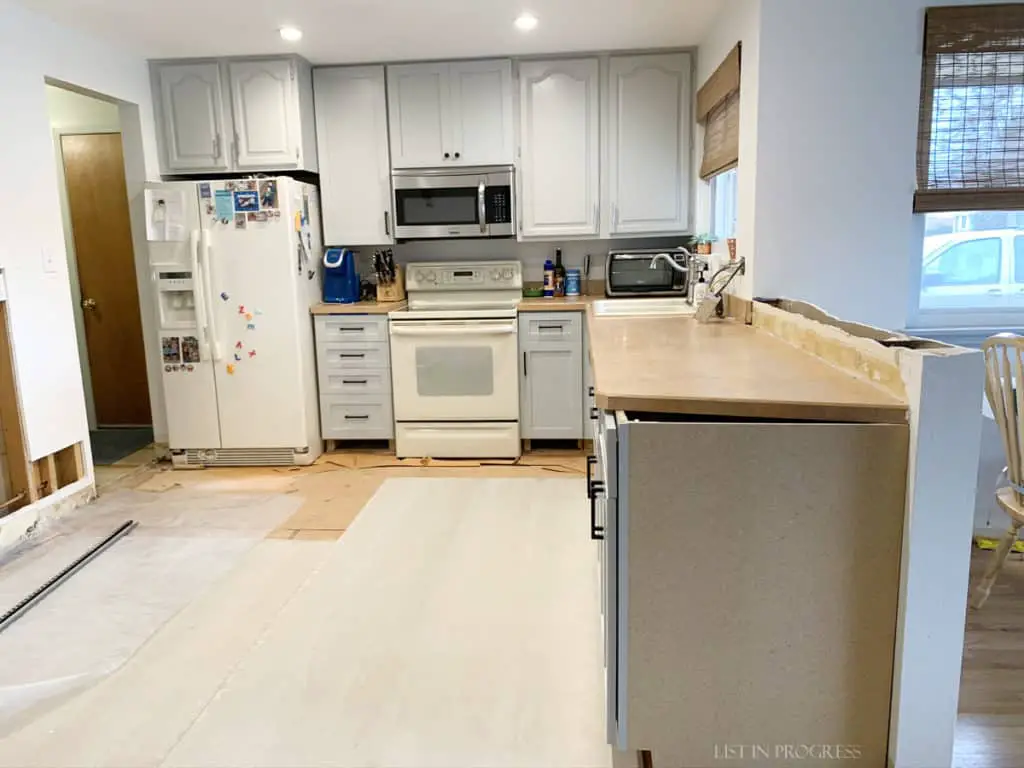
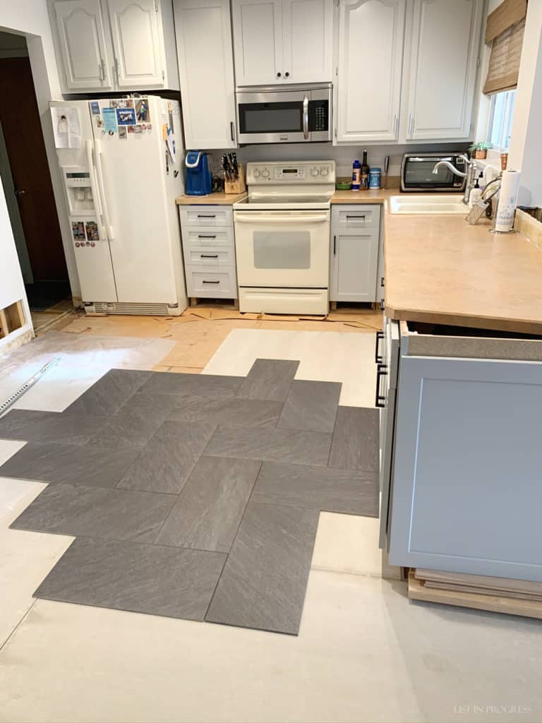
Here’s the current state of the kitchen. This is truly an “in progress” shot because you can see that we’re still changing out cabinet doors, laying cement board on the floor, patching drywall, and the old appliances and countertop are happily still in use. Although this is a sloooow kitchen remodel, the upside is that we can still use it almost the entire way through the project. The space is a long rectangle and this view is from one end of the room.
3 Tile Layout Possibilities
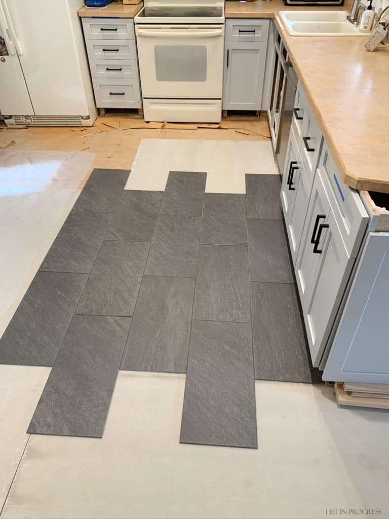
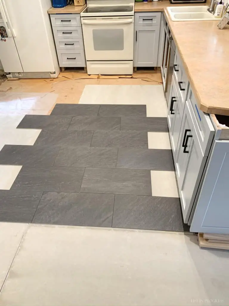
To visualize, I mocked up three tile layout patterns. I already have one in mind, but I wanted to see what the tile layout would look like against the cabinets and spanning a good chunk of the floor. As you look at these, keep in mind that the backsplash will be this glossy, white, 3×12 subway tile. Of course, I’m still debating the backsplash tile layout, too, but I’ll start with the floor and then see what feels like a good fit.
The flooring we selected is a charcoal color, textured, 12×24 inch porcelain tile. It really imitates slate pretty well but with a little less color variation and a more affordable price! Here’s the first layout, a running bond or offset tile pattern, spanning the length of the room. I like how this elongates the space and helps the kitchen feel slightly larger.
My second option is to turn the tiles 90 degrees for an offset pattern that spans the short width of the room. Although I like the contrast of this pattern against these cabinets, I wonder if the overall effect would feel like the tile runs against the grain.
The third tile layout option is a herringbone pattern. While I normally love this look, I don’t love it here on the kitchen floor. Perhaps the simplicity of the cabinets seems to work better with a running bond pattern? Or maybe because I’m considering the herringbone pattern for the backsplash tile and don’t want them to be too matchy-matchy.
Read More About Our DIY Home Updates
Favorite Behr White Paint Colors
Closet Door Ideas to Update Any Room
How to Apply Gold Leaf to Glass Decor
Trends in Cabinet Hardware
Other Floor Tile Factors
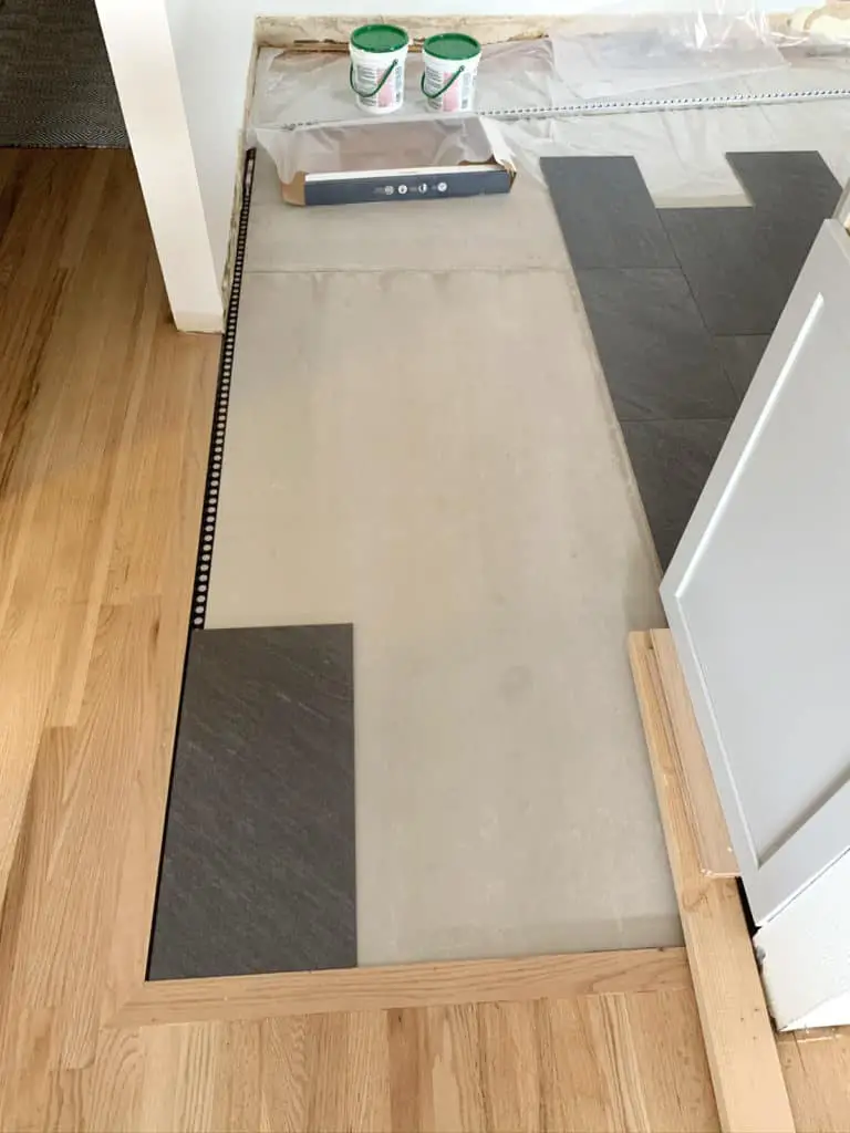
Why keep things so square and simple? I considered doing a running bond pattern on the diagonal, which would be pretty, but I later nixed that idea. I want the tile layout to begin squarely in this corner, where the kitchen floor meets the hardwood. Here’s a mockup with the black edging trim along the border.
Also, I can’t wait to try out this porcelain tile – it looks just like slate! We installed a slate floor in our last house (offset tile layout), and it was gorgeous. I bought this tile at Home Depot, so it was pretty affordable for a small kitchen. My only gripe was that it scratched easily with two kids and a dog.
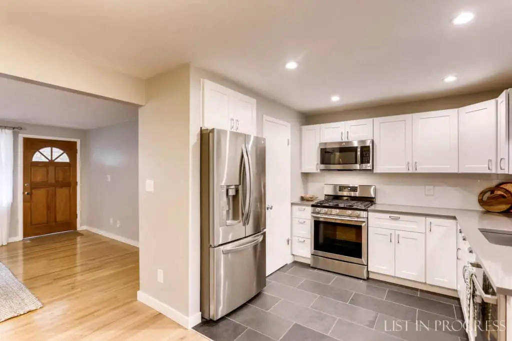
At the time, I couldn’t find a porcelain tile that looked remotely like slate, so we just tried the real deal. This time, I actually found a porcelain tile that is exactly what I had in mind five years ago! Isn’t it exciting when you’ve cooked up an idea and then finally discover it in stores? Part of the reason I’m repeating the look of this slate floor is to try out the porcelain tile version.
Product Sources:
Porcelain tile from Lowe’s
Slate tile from Home Depot
Black Schluter strip edging
Back to tile layout designs. Stay tuned to see how it turns out! If you have other suggestions, I would love to hear them. We still have a few more flooring projects on the list for this house…
To read more about our DIY kitchen plans, you might like:
How to Plan a DIY Kitchen Remodel
The Best Paint for Kitchen Cabinets
6 Modern Black Cabinet Pulls
This post contains affiliate links. If you click through and purchase something, I may receive a small commission. Thanks for your support!






Great article! Choosing the right kitchen floor tile layout is crucial for both aesthetics and practicality. The layout you select can enhance the overall design of your kitchen while also ensuring a seamless and functional space. Consider factors such as tile size, pattern, and grout lines to create a visually pleasing and durable floor that complements your kitchen’s style. With thoughtful consideration, you can achieve a layout that brings harmony and beauty to your culinary haven.
Can you tell me the Make of the slate look tile in this post?
Hi Kathy – Thanks for reaching out. This is the porcelain tile from Lowe’s. I added a few more links to that post to make it easier to click through to my sources.