If you’ve been with me awhile, you know we’re planning a laundry room remodel in the near-ish future. (Did I say that last year? Oops.) I’ve already purchased most of the items, but the longer we wait, the more I continue to revamp the plan. Today I’m sharing three potential laundry room remodel ideas and would love your feedback on which one you’d pick.
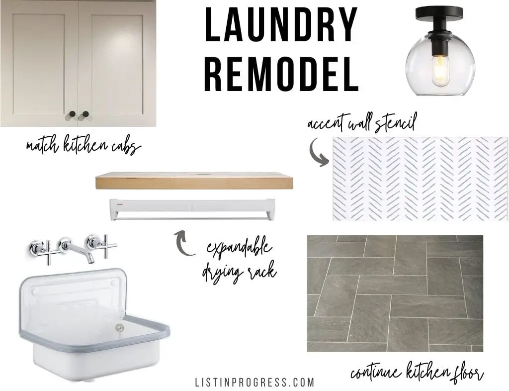
Laundry Room Remodel Game Plan
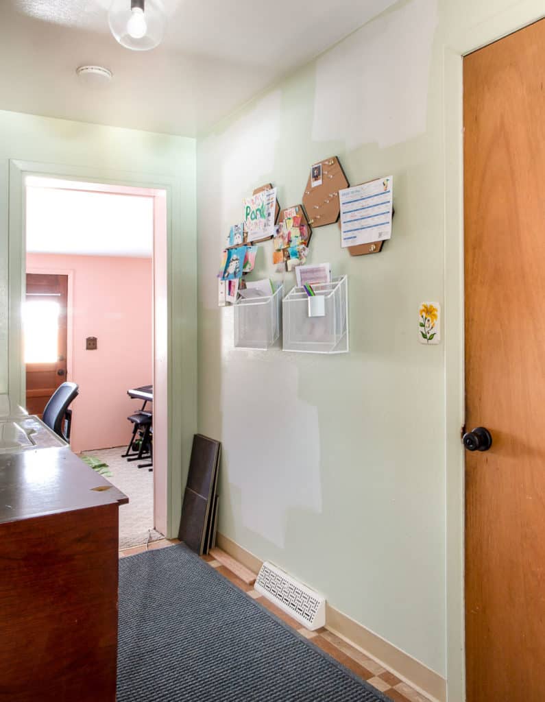
Our laundry room is really a “laundry hallway” connecting our kitchen to our family room addition in the back of the house. From this almost finished space. . .
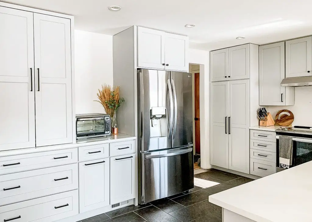
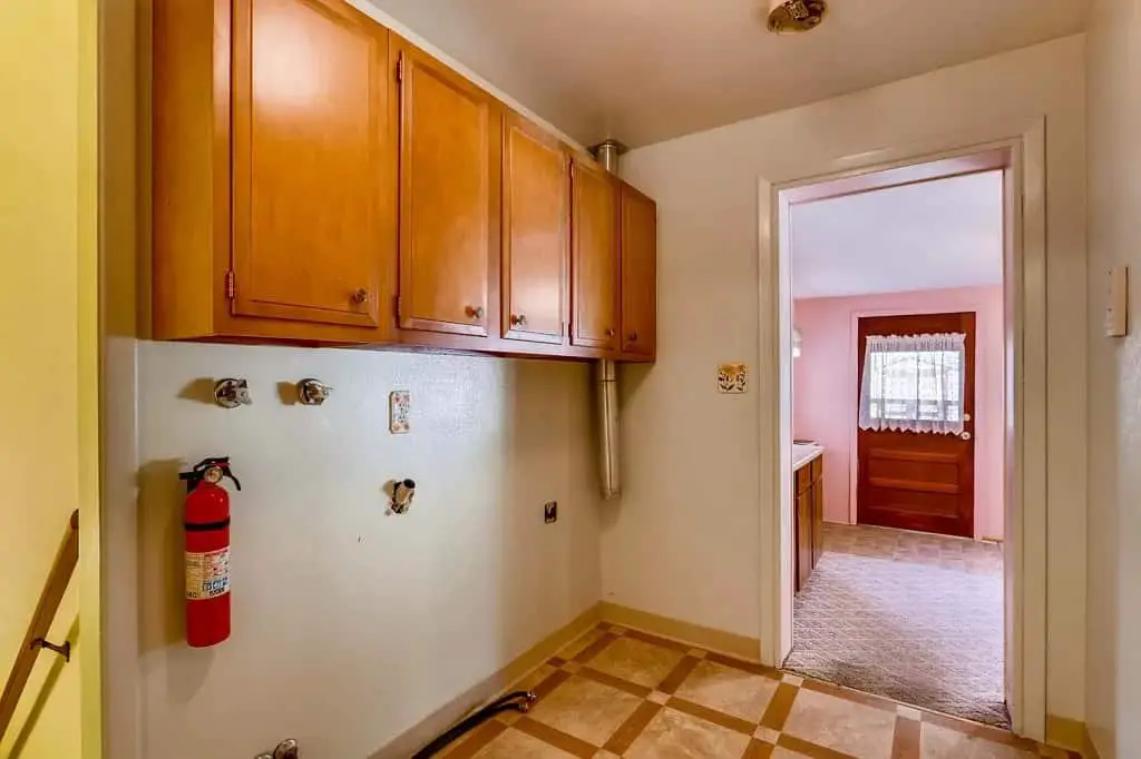
. . . into this hallway. I love having laundry on the main floor, but it’s a high-traffic space and gets cluttered quickly. I’ve been using the opposite, empty wall as a display zone for school info and art projects, but that’s temporary until we remodel.
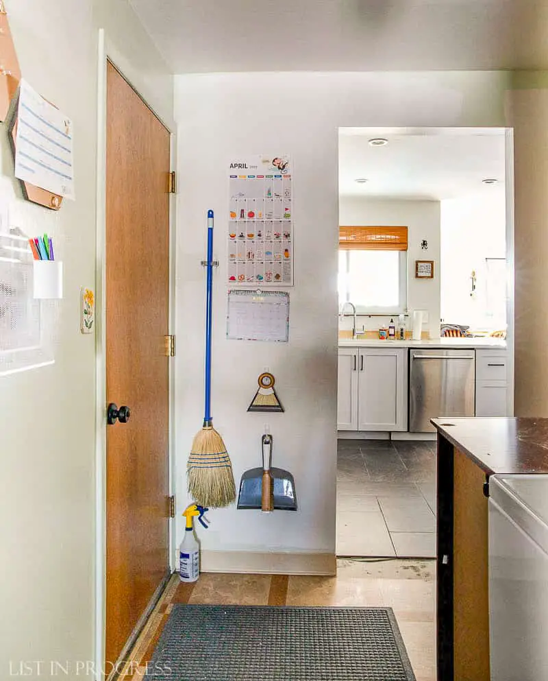
Facing the other direction, we store cleaning tools on the back of this wall, near the kitchen. Thank goodness for 3M hooks and broom holders. The door on the left leads into the garage.
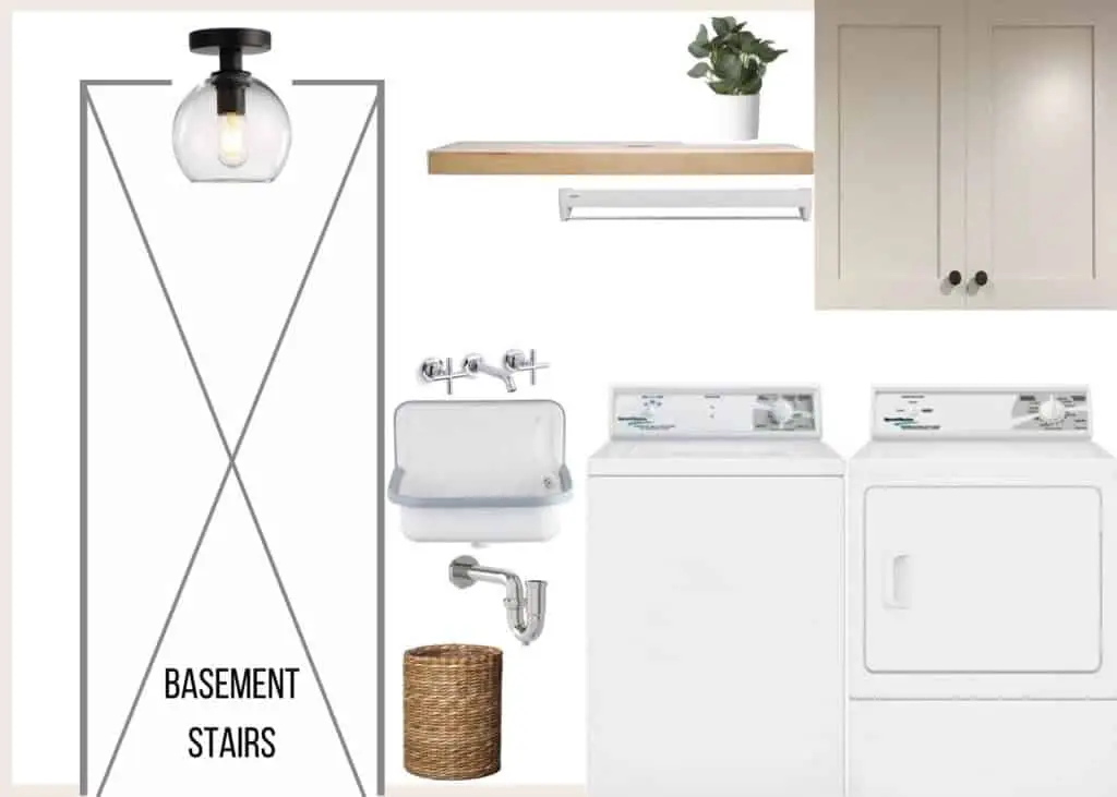
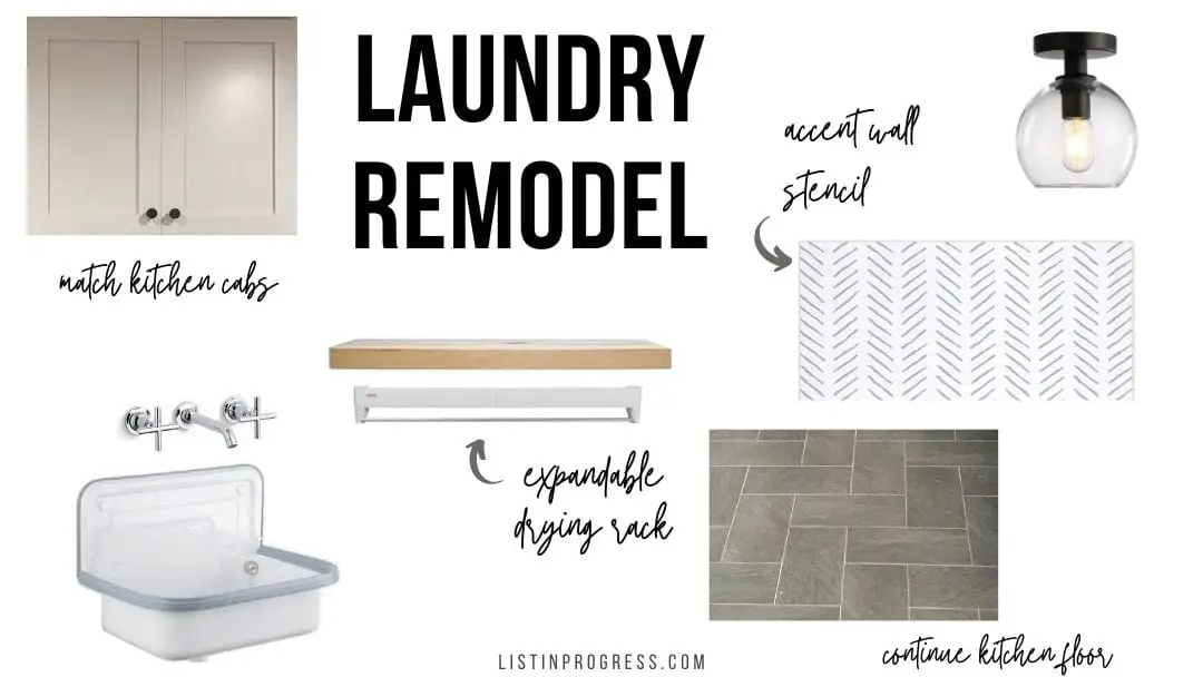
Our main idea for this renovation is to visually connect the space with our kitchen design. We plan to hang an old kitchen cabinet, already painted to match the kitchen, and continue to mix metals with both matte black and chrome fixtures. The porcelain tile floor will extend from the kitchen into this hallway. We’ll also reconfigure the wall behind the appliances to hide the dryer vent and recess the plumbing connections. Here’s our basic game plan:
- remove upper cabinets
- reconfigure wall behind washer/dryer (see below)
- paint entire space (color TBD)
- possibly stencil large wall opposite washer/dryer (design TBD)
- install old kitchen cabinet above washer/dryer
- install floating shelf, expanding clothes drying rack, utility sink, and faucet
But First… Let’s ReBuild a Wall
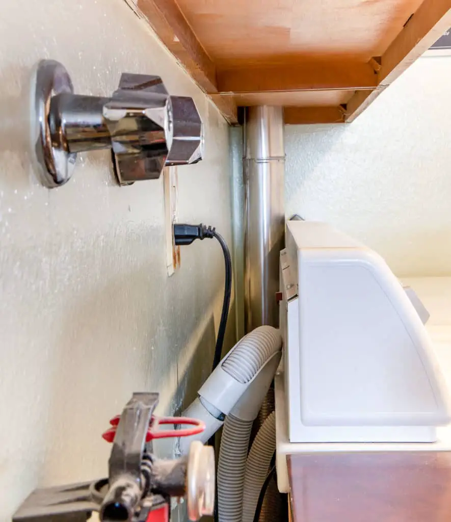
Before I break out the paintbrush and get cracking on a stencil, we have some DIY remodeling to tackle. For some reason, the previous homeowners thought it would be smart to run the dryer vent up through the cabinetry to dump lint in the attic. Wyatt fixed that fire hazard, but we’d still like to hide the vent.
Wyatt’s idea is to bump out the wall, basically transforming it from a 2×4 wall to a 2×6 wall, which will allow a 4″ dryer vent to fit easily inside the new 5.5″ wall cavity. We also want to add a recessed plumbing box behind the washer, so the drain doesn’t push the washer 3-4″ away from the wall. Currently, it looks like this.
Our Appliance Wall Layout Plan
This side of the room is mostly mapped out, and the redesign hinges on reusing an old kitchen cabinet. We saved one of the 30″ upper cabinets when we remodeled our kitchen, and it’s already painted to match in General Finishes Seagull Gray Milk Paint. We’ve measured carefully, and we *think* there should be just enough room to squeeze the cabinet over the dryer and still have clearance to open the washer lid. Fingers crossed.
Next to that cabinet, we plan to hang one floating shelf and this extendable clothes drying rack. Won’t it be handy to clip a few items right from the washer to the drying rack directly above?
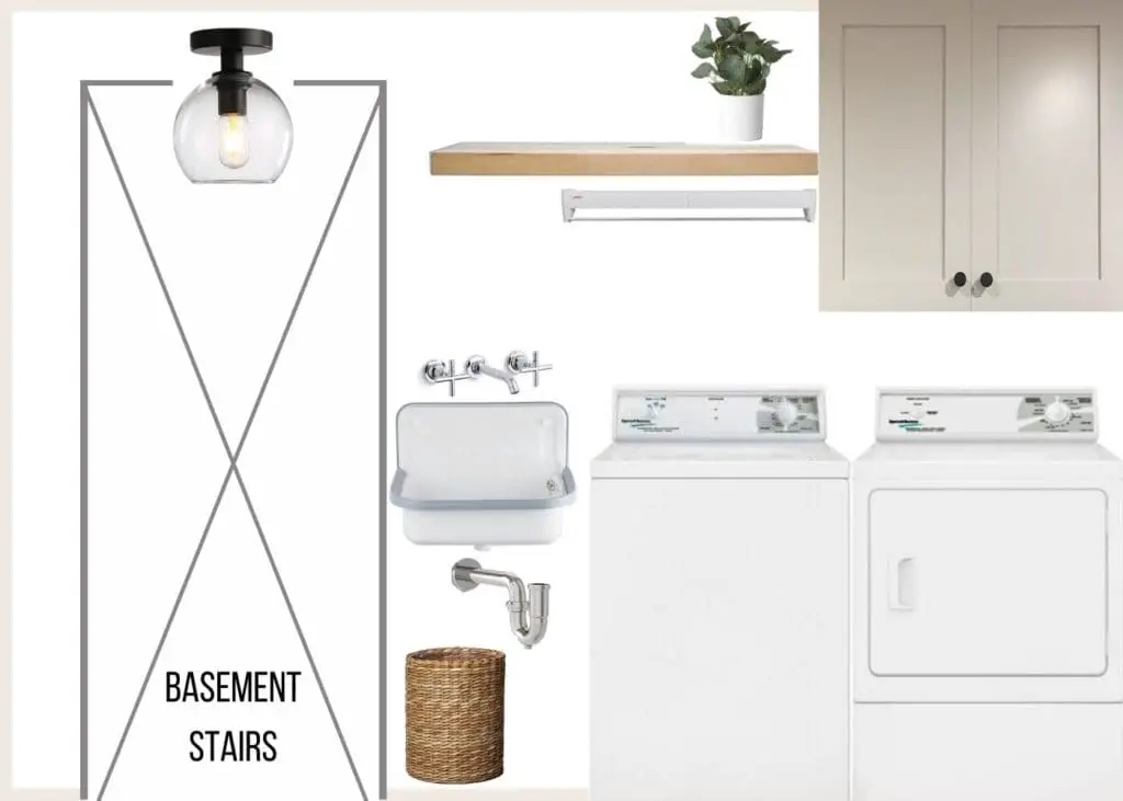
The best part of this laundry room remodel is the new addition of a small utility sink! We have only 21″ to squeeze in a small sink, and there are limited options in that size. I finally found this cute utility sink and can’t wait to install it.
How Much Design Wiggle Room Do We Have?
Not a lot. I started buying items for this project over a year ago, so I’m already mostly invested in the plan. For some reason, I bought a chrome faucet instead of matte black, but I think that’s my only regret so far. I was hoping it would tie in with the chrome kitchen faucet, but I now wish I bought the black version. (Does that ever happen to you?) Moving on! We’ll just make the best of it. Here’s what we have already, and the tile floor will just continue running from the kitchen.
Purchased Items:

1 – ceiling light
2 – faucet
3 – utility sink
4 – chevron stencil
5 – expandable drying rack
6 – floor tile
Help! Please Design this Wall
At last, let’s get down to it! Here is where I’d love some input. This is the wall across from the washer and dryer. I’ve shared my three tentative design ideas below.
Design Plan 1
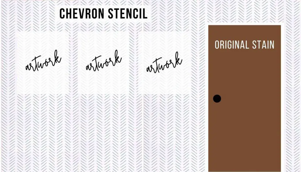
First, I was thinking of stenciling this chevron design in a subtle light gray over white walls (not blue, like you see below). I already bought the stencil, but I can save it for another project if this design gets axed.
Other side of room:
Design Plan 2
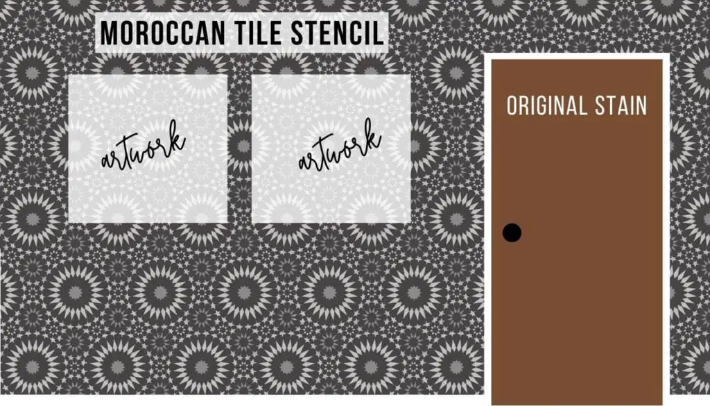
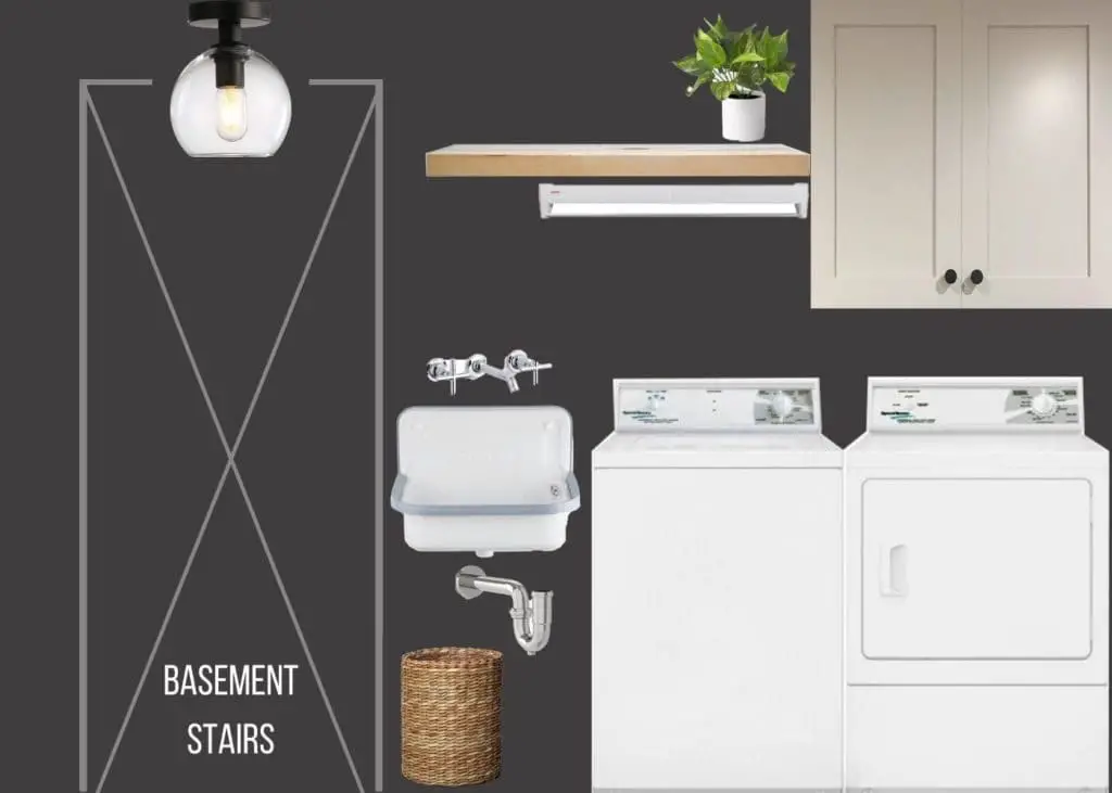
Ever since I discovered this amazing stencil work done in dark, moody colors (featured in this post on accent walls), it’s been stuck in my head. I’m thinking about creating a dark accent wall and I love this Moroccan tile stencil design. I also mocked up a deep slate color for the entire space, to really make a statement, but I think it might feel too dark in a hallway. Maybe just on one wall?
Budget Makeovers: Accent Wall Inspiration
Design Plan 3
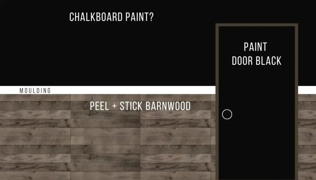
The third option is also darker than the original plan, but with more texture and not as busy as a full-wall stencil. I discovered these peel & stick barnwood wall planks, which should be easy to pop on the wall. Above that, how about a nice pop of color or even chalkboard paint?? I’m picturing a little white moulding ledge in between the two wall treatments, and I would leave the rest of the hallway white, as in Design Plan 1.
Help Me Decide!
OK, so now you know the plan, the limitations of the space, and the items we’re working with. What would you choose for this laundry hallway? Drop a comment below and let me know if you’d pick designs 1, 2, or 3! Thanks!
More DIY Remodeling Tips from List in Progress

1 – How to Create Craftsman-Style Door Trim
2 – Best Exterior Behr White Paint Colors
3 – The Best Flooring for Every Room in Your House
4 – 2021 Cabinet Hardware Trends






I vote for the lightest one. I like the chevron pattern (way too much work for me to do, but if you’re willing….) I think it looks the best and I don’t think you want to darken that space anymore than you have to. You want to see where to spray the stain remover 🙂
As an added idea for displaying calendars and artwork, I have magnetic bulletin boards in my office that In love. Got them 15 years ago so don’t know if they’re still available.
Thanks Alice! I have to say, I agree on the chevron at this point because it was my original idea! And you’re right about needing to see the clothing stains! Thanks for the bulletin board idea, too!
My vote is #1. The chevron stencil has been on my list for a long time. It adds depth without distraction.
Great point! Thanks! 🙂