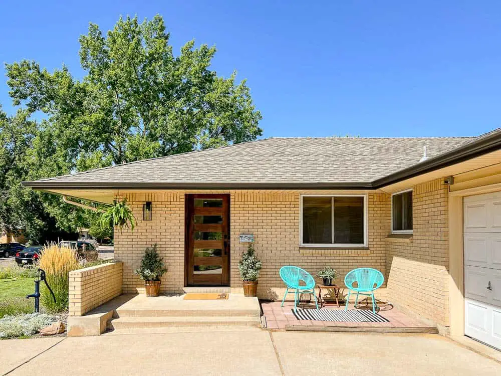
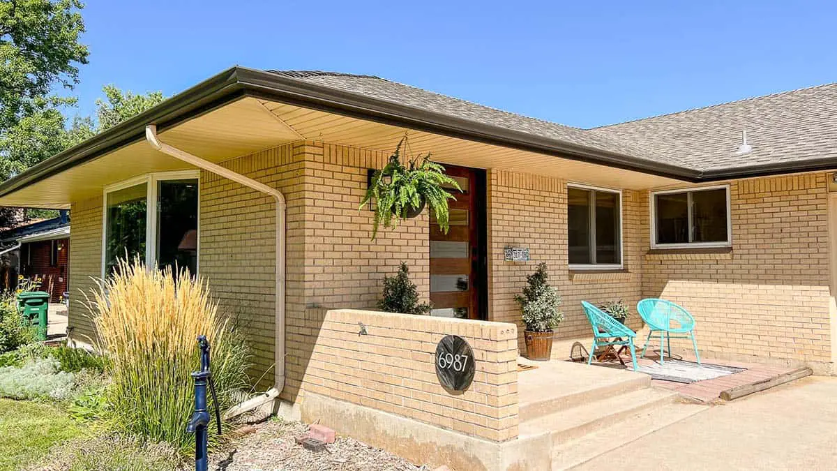
Our remodeled blonde brick house is finally 100% finished. And sold! That’s where I’ve been for most 2022… If you’ve been following for a while, you might have given up hope that we would ever finish and share photos on the blog. Well, today is the day. Come on in and see the final result!
A year ago, we moved out of this blonde brick house into our new home, which I shared in this post. Ever since, Wyatt and I have spent every spare moment working on the old house, trying to wrap up the remodeling. The problem with having jobs and kids and living 45 min away is that our DIY projects took soooo much longer to finish. Luckily, we found lovely buyers despite the shifting marketing conditions and rising interest rates – and we finally sold it!
Read More: 5 Tricks for Staging a House on a Budget
Ready to dive in? You might want to hit pause and go refill your coffee. This is a long post, chock full of details and brand-new updates. I will share as many sources as possible at the end of this post.
Our (Finally) Completed Blonde Brick House!
Overview: How Much Did We Really DIY?
Exterior Photos and Features of This Home
Welcome Home, Come In (Entry)
Living and Dining Room Updates
Kitchen Details
Laundry Room/Hallway
Family Room in Back
Simple Bedrooms on Main Level
En Suite Master Bathroom
Main Floor Bathroom
Basement Remodel + Retro Bar
SOURCES
Blonde Brick House DIY Overview
As a DIY home improvement blogger, I try to be transparent about the projects we tackle ourselves. However, we also hire contractors for certain projects when we need a) licensed professionals and/or b) more skilled tradespeople. For this house, we hired electricians, plumbers (especially for gas lines), drywallers, countertop and carpet installers, and tile pros. We did nearly everything else ourselves.
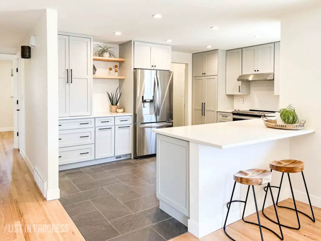
Some of those projects we can and do complete ourselves, like tile, but it’s more efficient to hire a contractor when we’re in a time crunch. Feel free to ask questions in the comments section below. I often field questions about how we choose who/when to hire, etc.
Read this post to see the before photos of this house in its 1980’s glory. You’ll see how far we’ve come.
Now, on to the good stuff!
Exterior Shots and Features
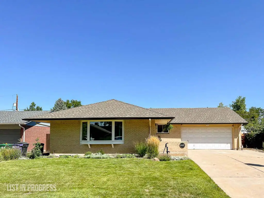
Here’s the exterior of our blonde brick house. It’s south-facing, which is the only reason we committed to a huge driveway in Colorado (so the snow melts quickly). As you can see, there is a LOT of blonde brick going on. And “blonde concrete” as well…
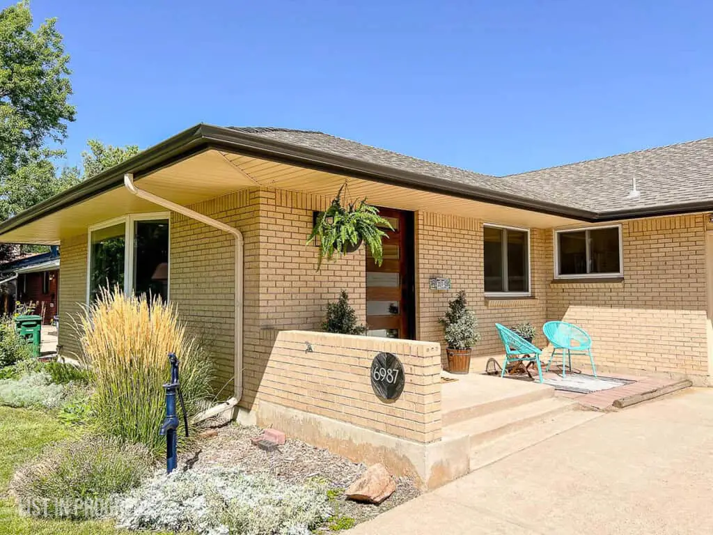
Question for you. “Blonde brick” sounds a little pretentious to me, but the internet seems to like it. What do you think? Perhaps it’s because yellow brick is a bit “Wizard of Oz” and beige brick sounds very 1990’s? In any event, I do love a brick exterior because it’s so low maintenance.
While we lived here, it was fun to add a pop of color through hanging ferns and seasonal flowers. They show up beautifully against the tan brick color. I hung Western ferns, the dry-climate-friendly cousin of Boston ferns, and they last all season.
Tips to Install and Stain a New Front Door
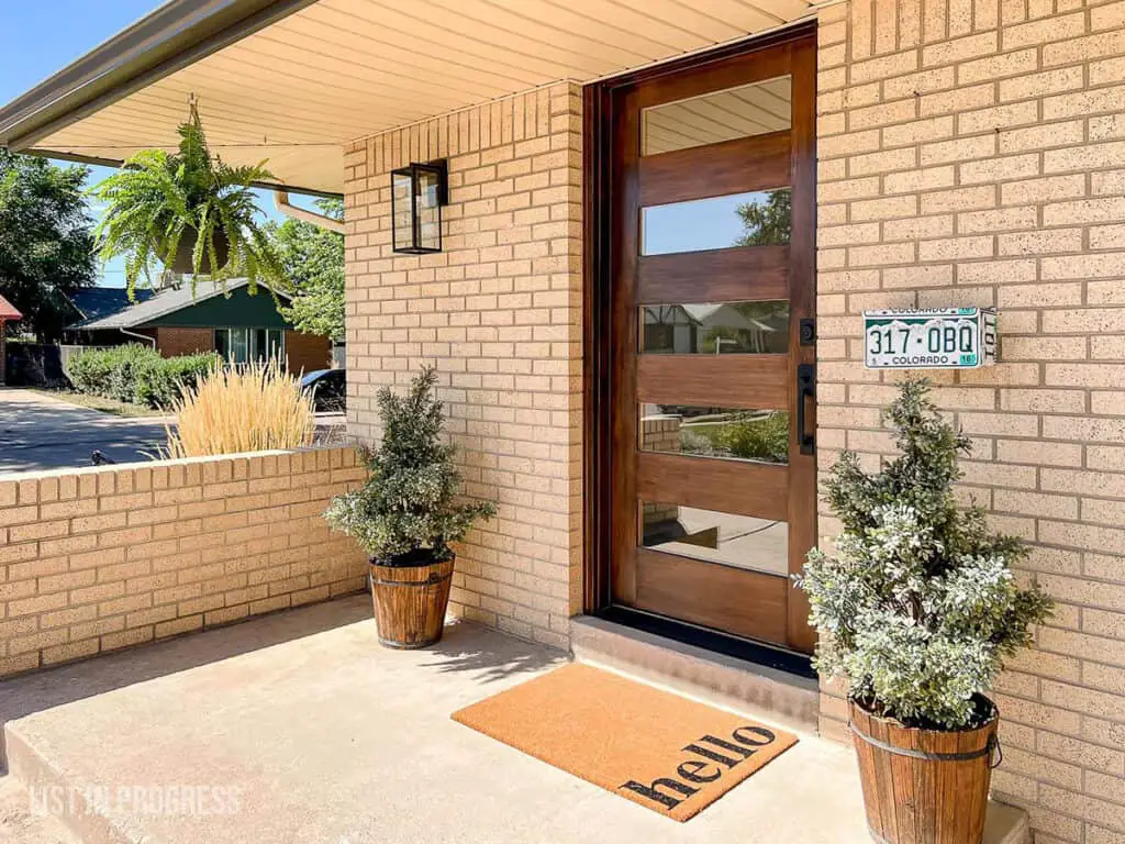
We added low-water, drought-resistant landscaping to the front yard a few years ago to give it time to mature. The hardiest of the lot has to be catmint, lamb’s ear, ‘Karl Foerster’ feather reed grass, and ‘red flame’ switch grass. In case you’re looking for full-sun plants that can tolerate a little neglect, those are pretty solid picks.
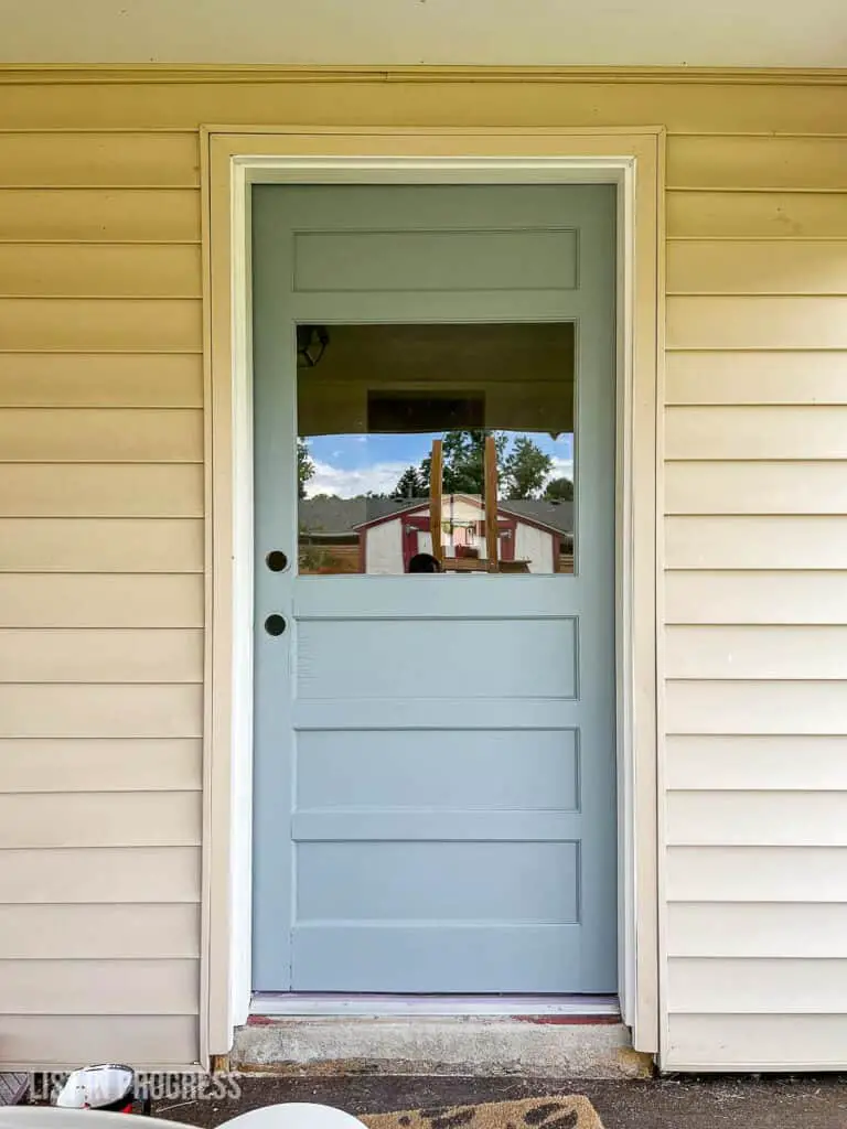
There’s a covered patio in the backyard, but not much else to add excitement. I painted the back door Cloudy Sky by Benjamin Moore. It looks a million times better, especially with the blue-gray door color to tone down the yellow on the blonde brick house. Progress shot:
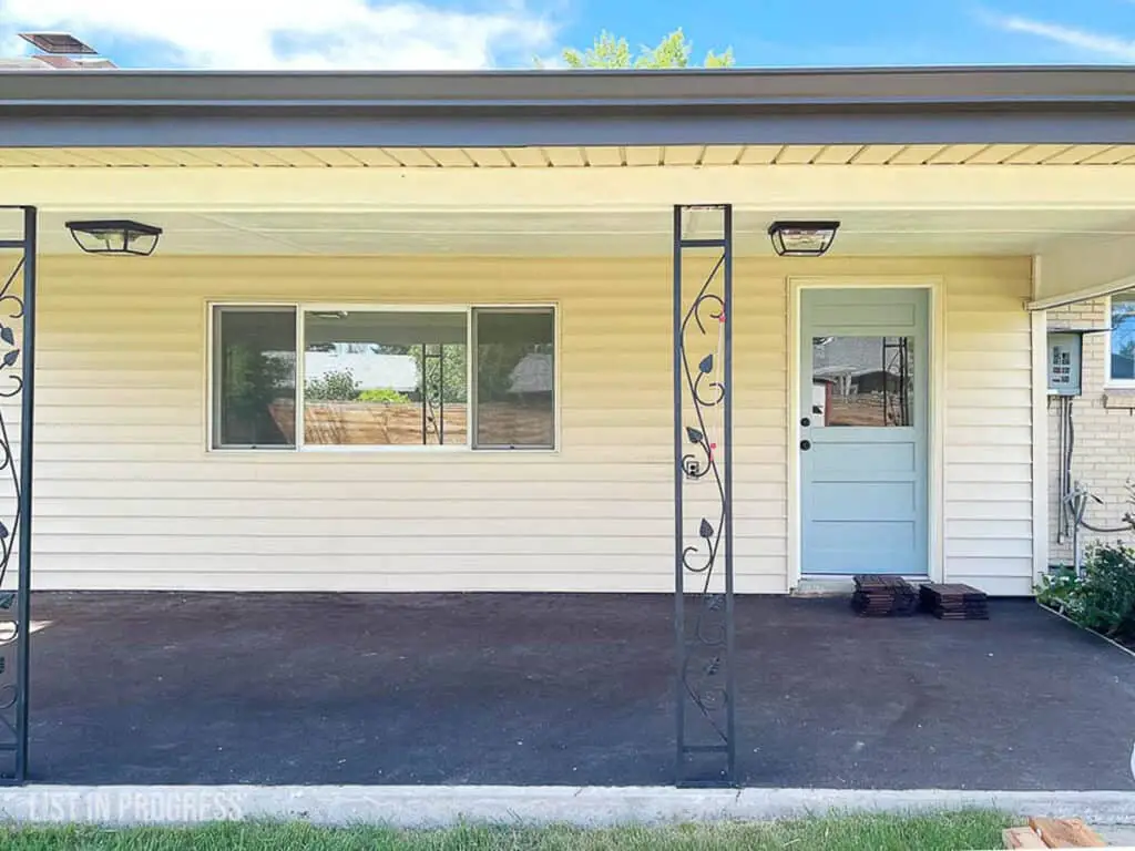
We also installed this IKEA wooden flooring on the patio, right over the original carpet (!). We planted three trees in the backyard, and in about 10 years, future owners should have a nicely-shaded yard!
Here’s the Best Match for IKEA Varda Wood Stain
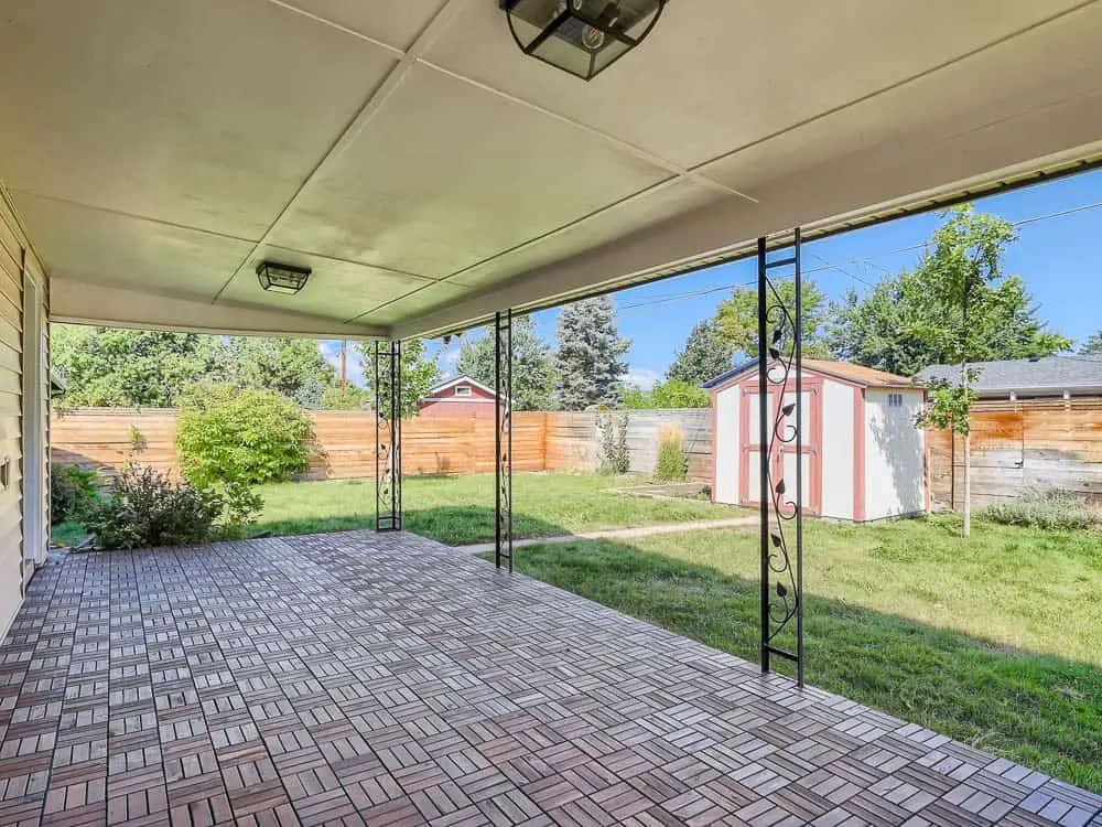
Of all the listing photos I took, this one is my favorite:

Welcome Home, Come On In
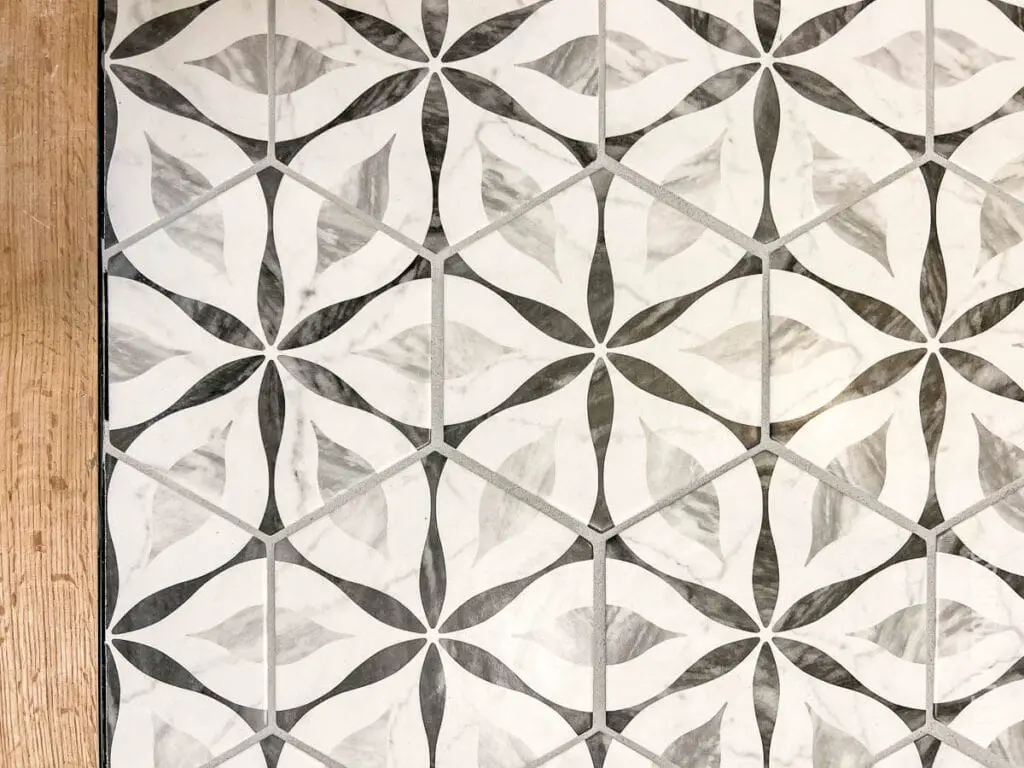
The entry is my favorite spot. We added a fun Moravian star flush mount light and vinyl hexagon floor tile to bring both modern and traditional vibes to the entryway.
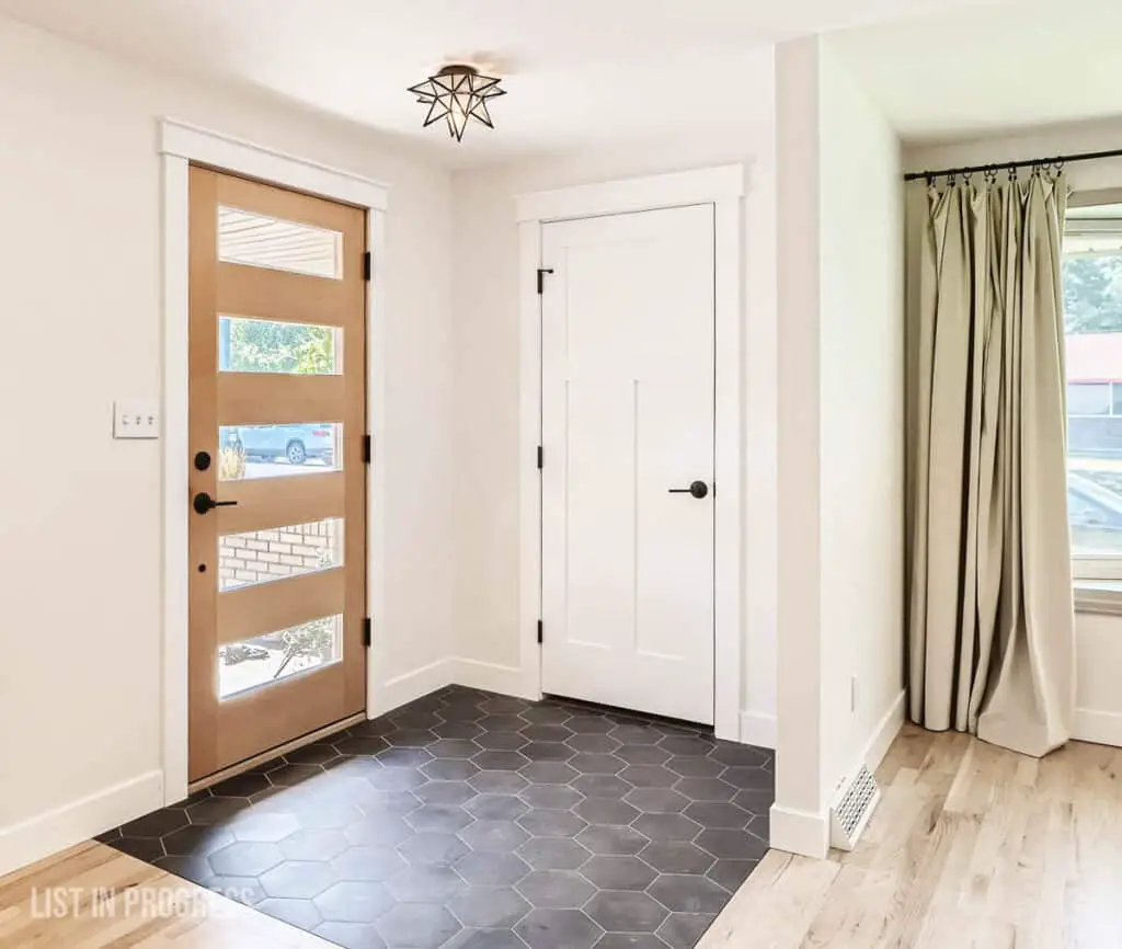
For more details, check out my posts on affordable flush mount lighting from Amazon and our DIY groutable vinyl floor tile project. This tile is one of my favorite DIYs!
The entire house is painted with Behr Premium Plus in Silky White, eggshell finish. While Behr is great for walls, I prefer Benjamin Moore for ceilings, which I explain in this post on the best ceiling paint.
My Favorite Behr White Paint Colors
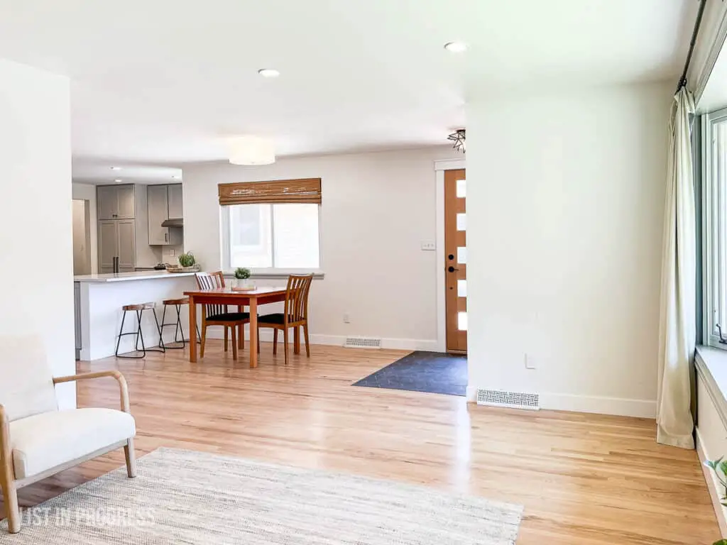
You Might Also Like:
How to Lower Your Electric Bill (Without Going Crazy)
How to Create Craftsman-Style Door Trim
Best Exterior Behr White Paint Colors
The Best Flooring for Every Room in Your House
Living and Dining Room Updates
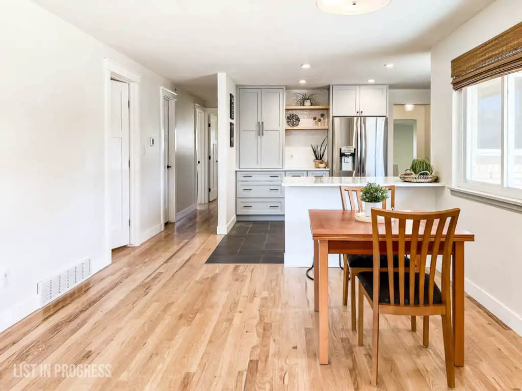
As you can see, the living room is a long but narrow space at the front of the house. The upside is that it gets tons of natural light from the south-facing bay window. The downside is that we rarely used the space, outside of remote learning during COVID. However, it’s the first room you see, so I had fun designing a basket wall for visual impact.
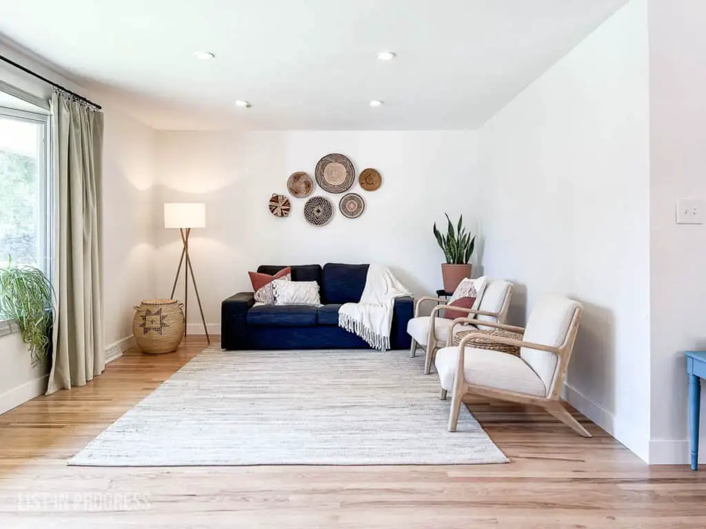
I painted the wood window trim with General Finishes Milk Paint in Seagull Gray, which I had left over from the kitchen cabinet project.
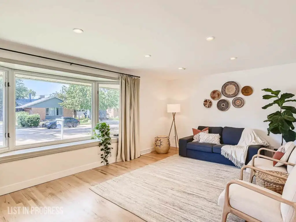
The other updates to these open-concept spaces are pretty simple. Before we moved in, Wyatt refinished the red oak floors with StreetShoe in satin, a water-based finish that held up well and never yellowed over time. We will definitely repurchase that product.
Kitchen Details
This kitchen was a labor of love (and a test of our patience). We saved some of the custom 1980’s oak cabinets, added new shaker doors and drawers, plus additional new cabinets to extend the storage space. I painted everything (twice!) and you can read all about it in these blog posts:
How to Plan a DIY Kitchen Remodel
How We Saved $20,000 on Our DIY Kitchen Reno
The Best Paint for Kitchen Cabinets
2022 Cabinet Hardware Trends

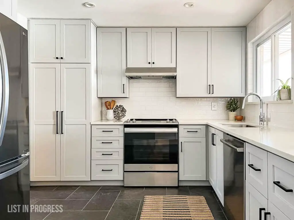
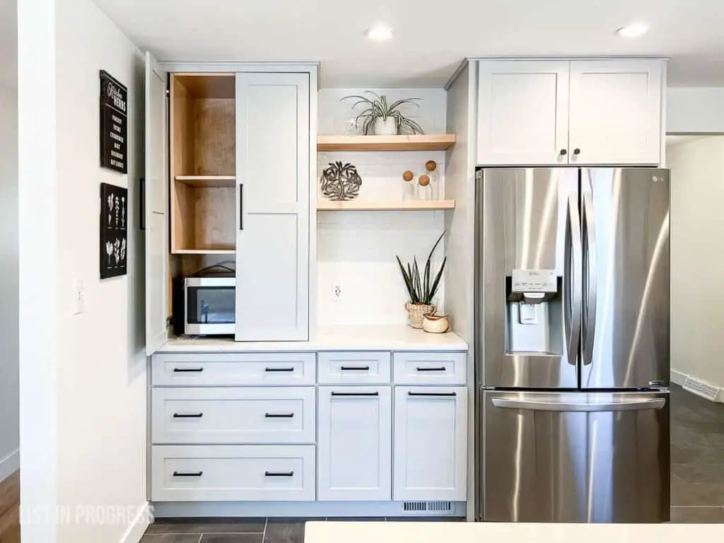
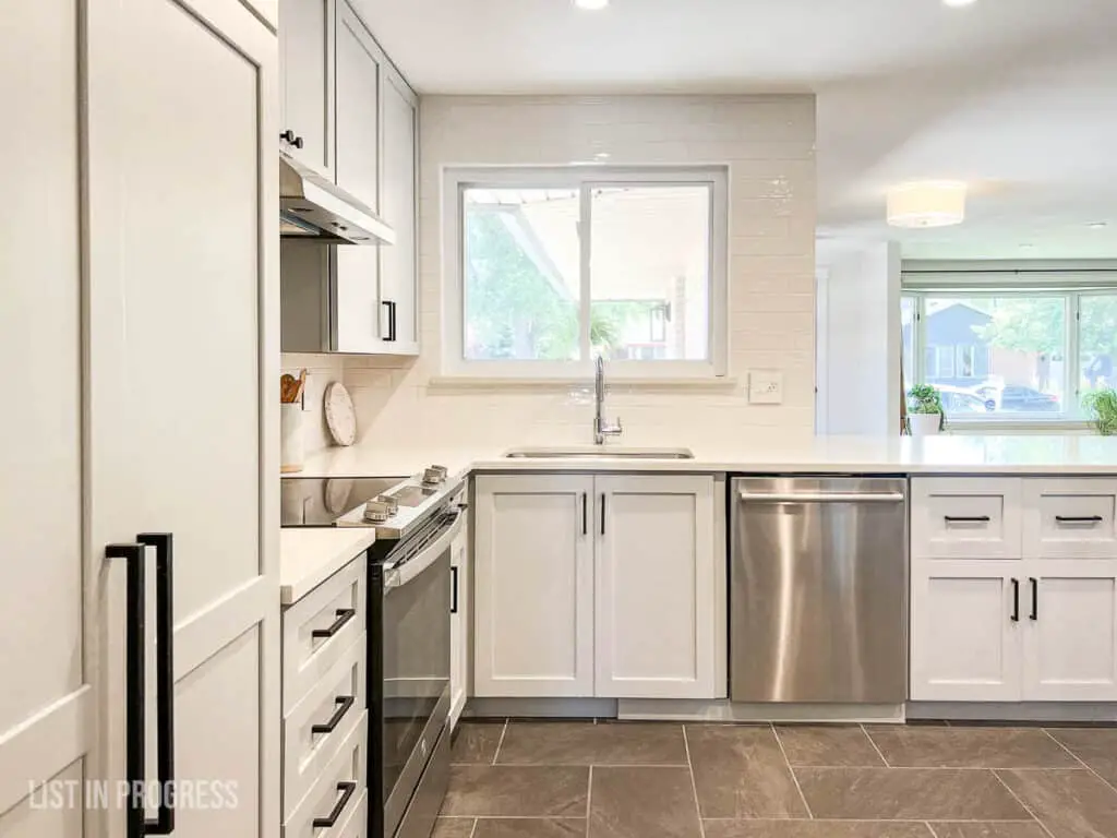
At one point, I calculated that we saved about $20K by crafting and coordinating most of these updates ourselves. If you have the time, skill, and patience for a project like this, it could be worth substantial savings!
Laundry Room/Hallway
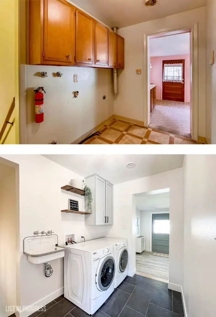
Here’s a spot that hasn’t seen a ton of airtime on the blog. That’s because it only came together in the final months before we sold the house.
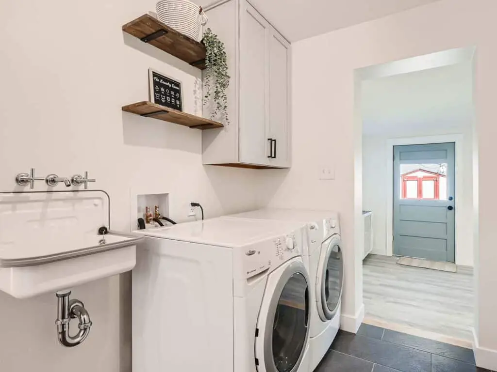
These are the laundry room updates:
1. Wyatt extended the porcelain floor tile from the kitchen into this hallway.
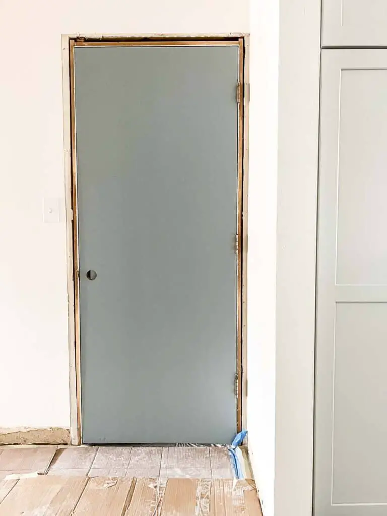
2. I painted the door leading into the garage the same color as the back door – a new favorite – Cloudy Sky by Benjamin Moore. This is a lovely chameleon color that goes from light, bluish-gray on the back door to a moody greenish-blue inside, in dim lighting. I can only find this progress shot of the door, but here’s the black door hardware we installed on both of those exterior doors.
3. We repurposed one of the old kitchen cabinets, already painted to match, as a storage spot above the dryer and added these acacia wood shelves.
4. I sourced a FREE new(ish) washer/dryer from my Facebook Buy Nothing group, which was a huge boon to the budget.
5. Last, my favorite detail in this laundry room is the utility sink. It’s so cute and will be handy for future owners. I constantly wished for a utility sink in this house and was excited to design the space around this small 20″ sink from Rejuvenation. I splurged on this cross-handle faucet in chrome and a simple chrome p-trap, although you could also choose a more modern design like this style. We invested in that particular faucet because I searched for the shortest spout, so it wouldn’t spray water out of the basin.
Want to see how far we’ve come? Here’s a before and after:
You Might Also Like:
How to Lower Your Electric Bill (Without Going Crazy)
How to Create Craftsman-Style Door Trim
Best Exterior Behr White Paint Colors
The Best Flooring for Every Room in Your House
Family Room in the Back
Another space you haven’t seen featured yet is this family room, an addition off the back of the house. That’s because it was still painted three shades of pink until last July.
This room is the bonus space that initially sold me on the house, because it adds a secluded zone to relax away from the rest of the home.
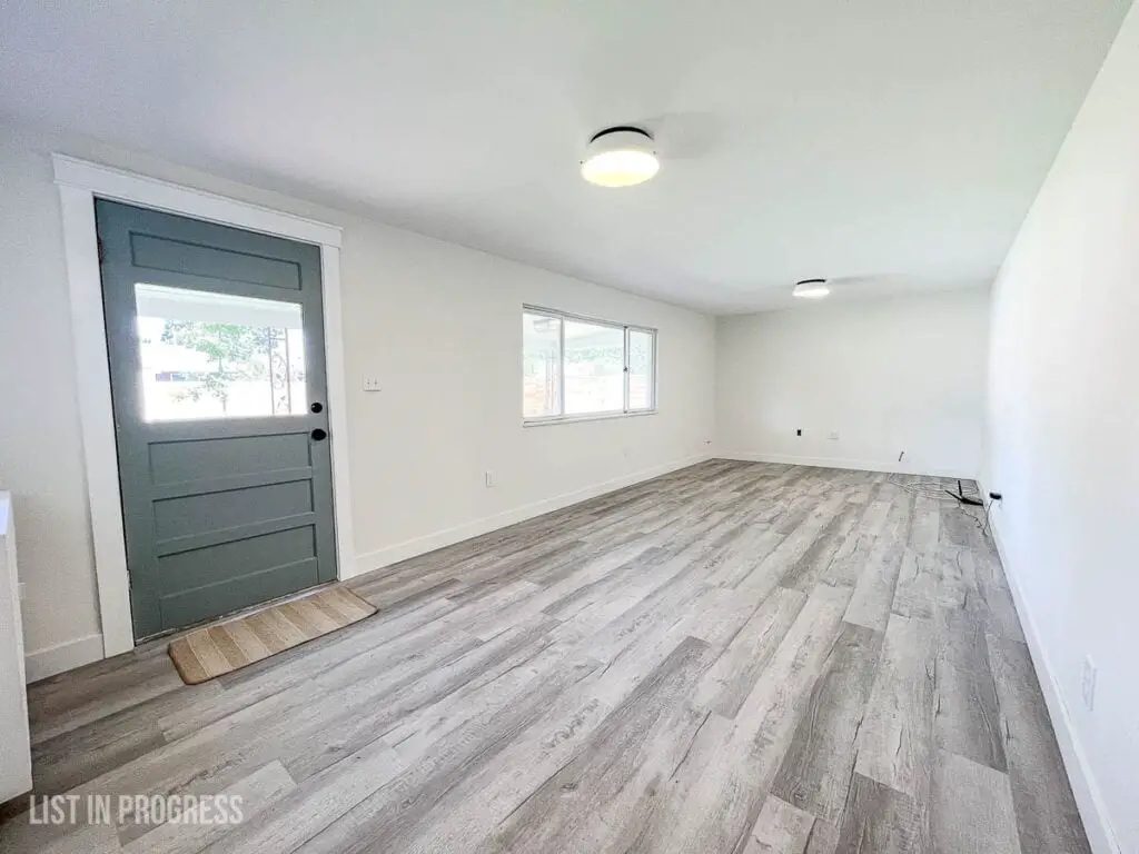
Although it looks straightforward, there was a bit of work required to bring this room up to date. When the original owners went pink, they painted over brick (the original exterior wall) and wall paneling. To update it, we asked our drywaller to install new sheetrock around the room for consistency.
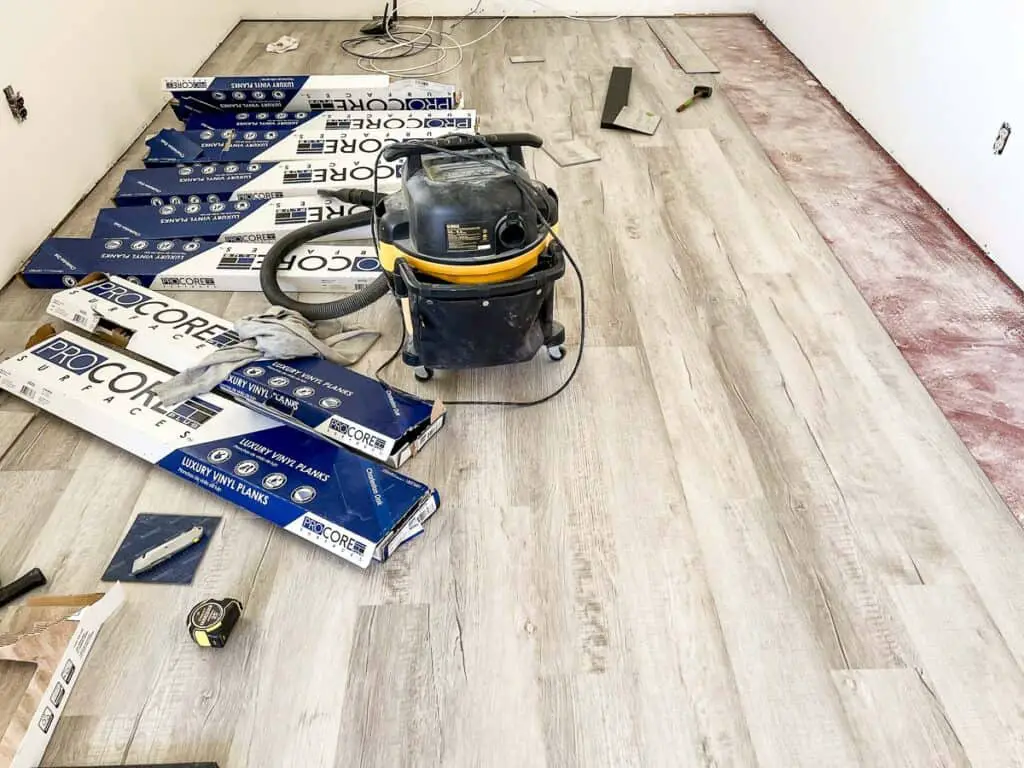
I installed a floating vinyl plank floor, directly over the old concrete slab. I plan to share my beginner tips for this project in a future post because I learned a LOT in the process. The flooring is Style Selections in Charleston Oak.
We added these low-profile ceiling lights, and I recommend them if you’re looking for a shallow flush mount with real bulbs, not an LED fixture. The line is Duncan by Golden Lighting and it’s available in a range of colors and metal finishes.
I also painted the back door the same color on the inside and outside (it’s exterior paint). Cloudy Sky by BM, as mentioned earlier. It’s very pretty in this space against the white walls and gray flooring, as well as from the outside against the tan siding.
Simple Bedrooms on the Main Floor
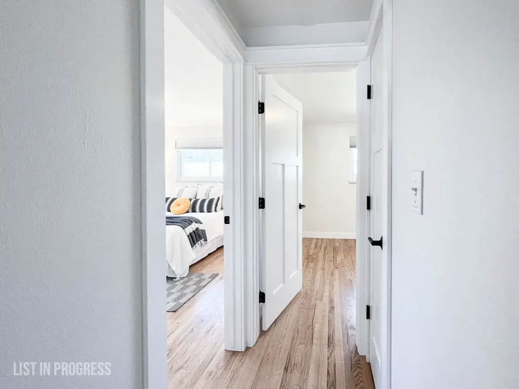
Moving back to the center of the house, there are three bedrooms that start off the kitchen and run back along the left side. We kept these rooms simple with Behr’s Silky White eggshell paint and Ultra Pure White semi-gloss on the trim and doors.
How to Install Craftsman-Style Door-Trim
Oversize Lumbar Pillow Roundup
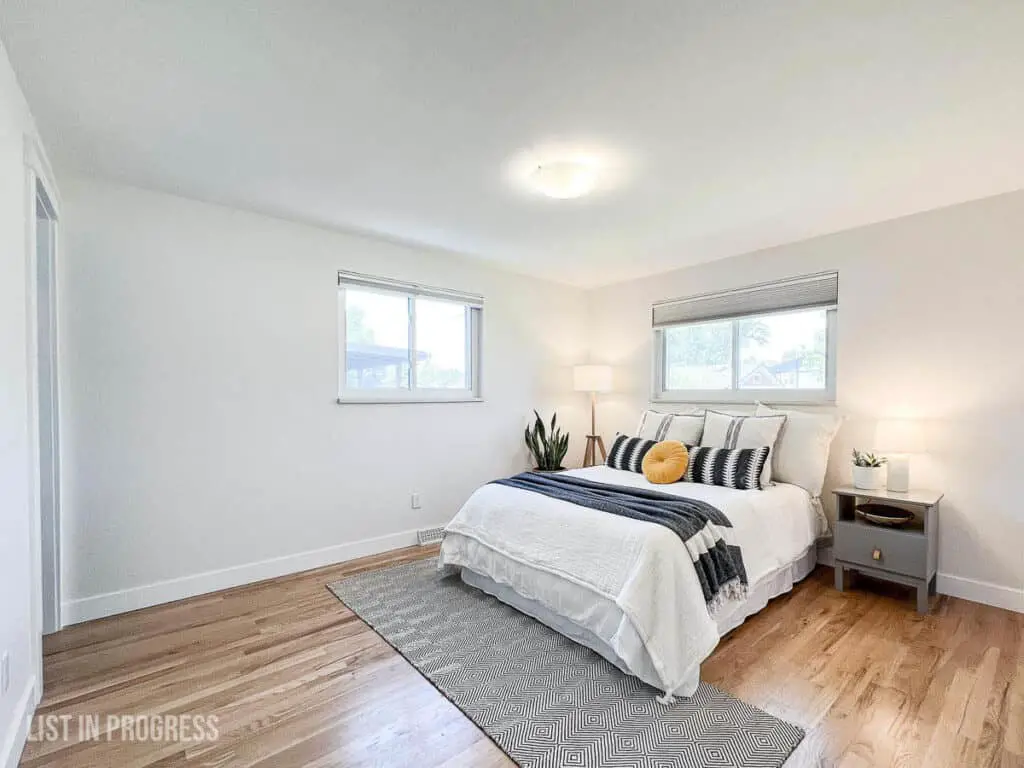
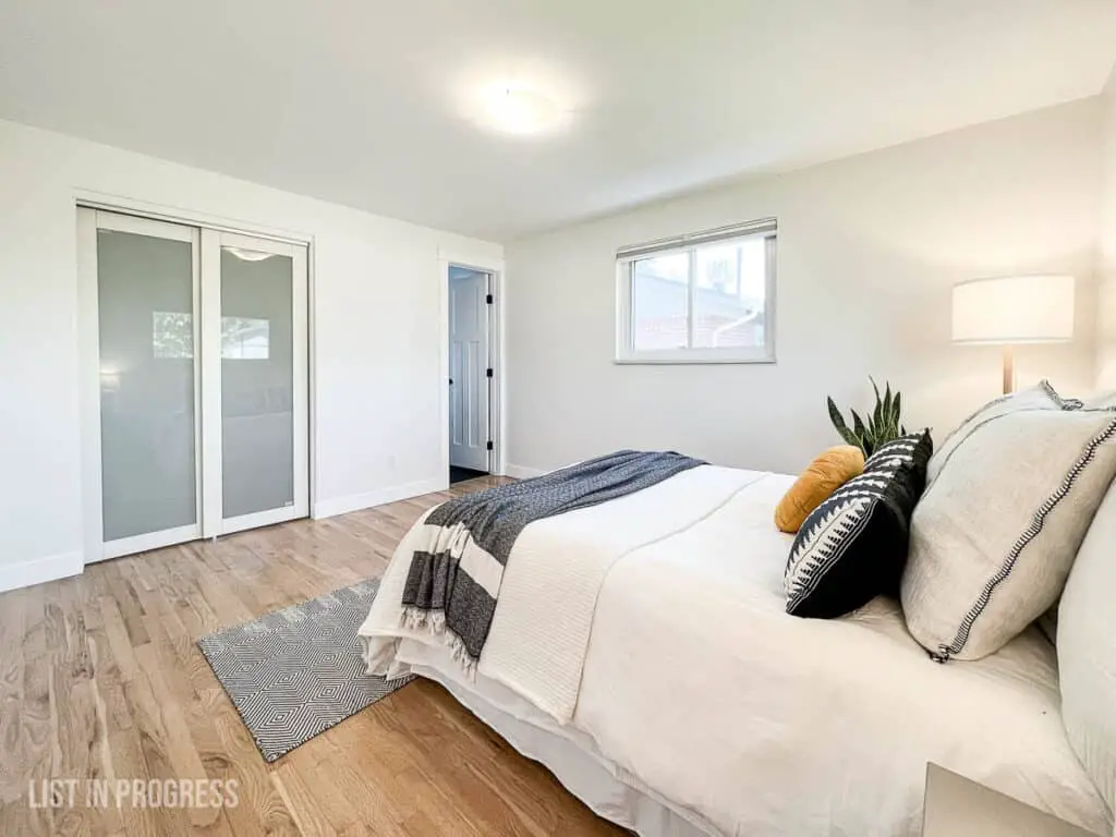
The master bedroom + en suite bath is the featured room, so we installed a new, sliding glass door on that closet. I chose this door from Wayfair and luckily it arrived in perfect condition. Heads up, you won’t be able to paint the frame.
Oversize Lumbar Pillow Roundup
En Suite Bathroom Remodel
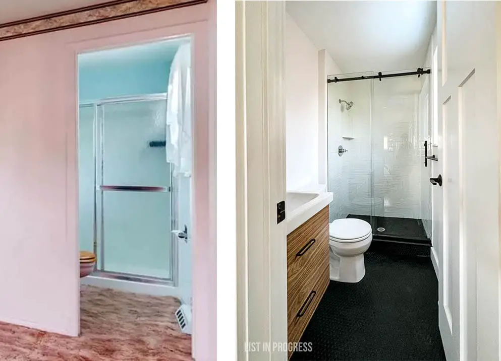
Moving on to the bathrooms, here’s one of my favorite spots in the house. How stunning is this black-and-white scheme in a convenient little en suite bathroom? It has an exterior window, so the natural light brightens the entire room and makes it feel a little bigger.
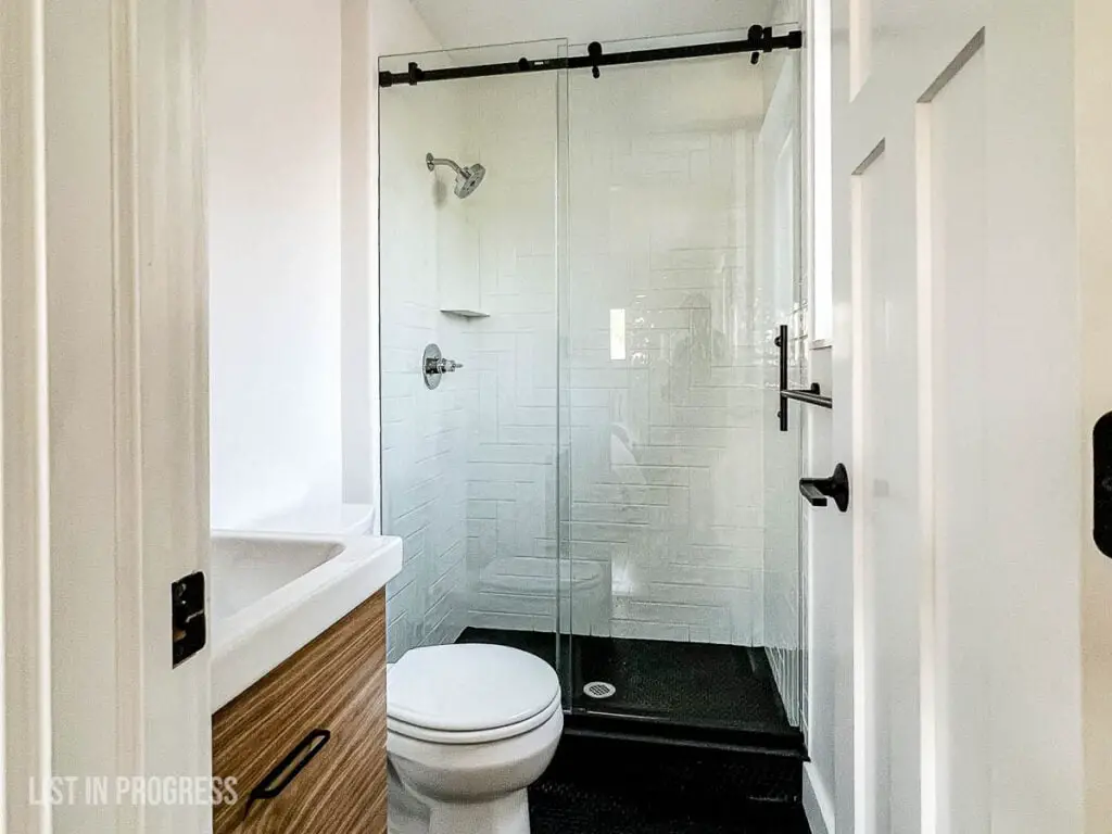
To save time, we hired a tile installer for the shower and floor tile work. I designed this Daltile 3 x 12″ tile with white grout in a straight herringbone pattern in the shower, which you can see through the sliding glass shower door. Visually, it makes such an impact in the room.
I chose black penny tile with black grout for the floor of the entire room, including in the shower. One of the tricky parts of tiling a shower is the curb, so I sourced a black granite threshold from this online shop. It came together really well and the colors coordinate nicely. This is a progress shot, but you’ll have a better view of the floor:
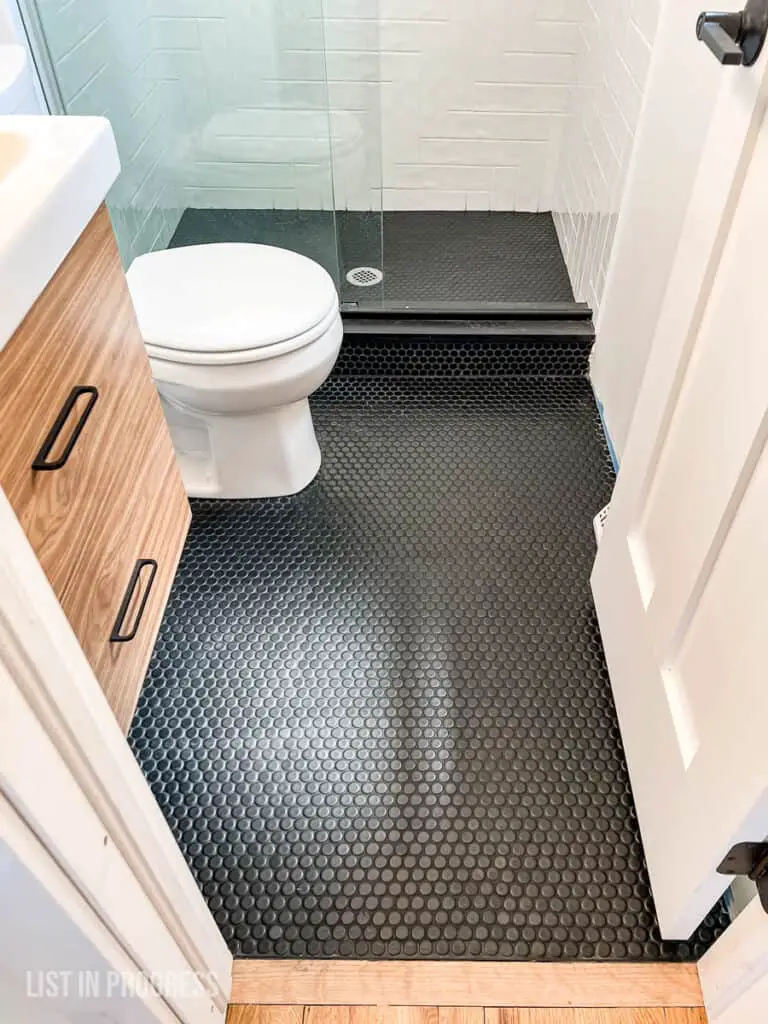
The vanity and sink are from IKEA but I ordered custom walnut drawer fronts from Semi-Handmade to add warmth to this space. They are gorgeous!
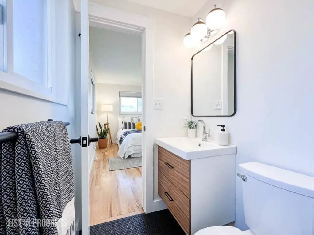
You might notice the mixed metals in this space, which is my preference to add dimension. I find 100% black hardware looks flat in some spaces, so I bought a chrome shower trim kit and my favorite sink faucet. I found this vanity light in chrome and black to help tie the finishes together, and we installed this rounded rectangular mirror and these black drawer pulls.
To really appreciate the evolution of this bathroom, check out these before and after shots:
Main Bathroom Final Touches
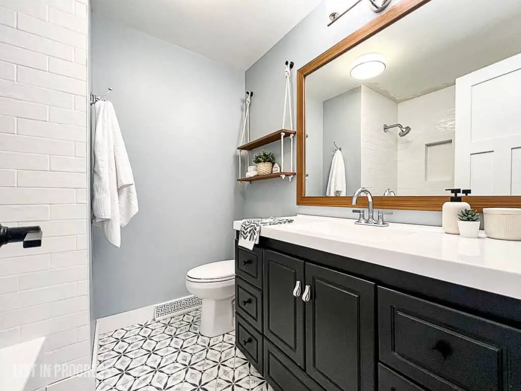
This main floor bathroom has been a work in progress for years. We painted the walls Krypton by Sherwin Williams before we moved in, and then I painted the vanity black with General Finishes Milk Paint (super easy – no sanding required!).
Here are some of the blog posts I’ve shared about this space:
The Easiest Cabinet Paint
Three Ways to Build a Bathroom Mirror Frame
How to Make Simple Hanging Shelves
When we tackled the second half of this room, I was reeeeallly hoping to uncover a 1960’s turquoise bathtub in decent condition. Instead, I found a Ming green original bathtub with some serious scratches, and it didn’t work with the rest of our modern traditional design choices. Here it was on the big reveal day:
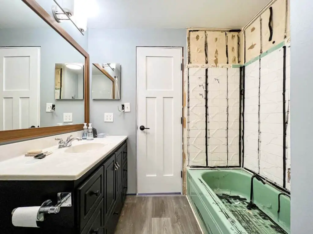
In an effort to save this from the landfill, we hired someone to refinish the tub with a new, white glaze. Unfortunately, it bubbled up with what he called “fish eyes” and no amount of sanding and repainting seemed to fix that problem.
So. Out with the old and in with this new Kohler tub. That sentence makes it seem easy, but anyone who has removed a cast iron bathtub knows that would be a blatant LIE. Kudos to Wyatt and YouTube for getting it done.
For this shower, we installed the same white 3 x 12″ tile as in our kitchen and en suite bath. Both the kitchen backsplash and this bathroom have a 1/3 offset running bond tile pattern.
(Just when I think I’ve taken every possible photo, I realize that the only shot of the new tub and tile was taken when we tested it for leaks.)
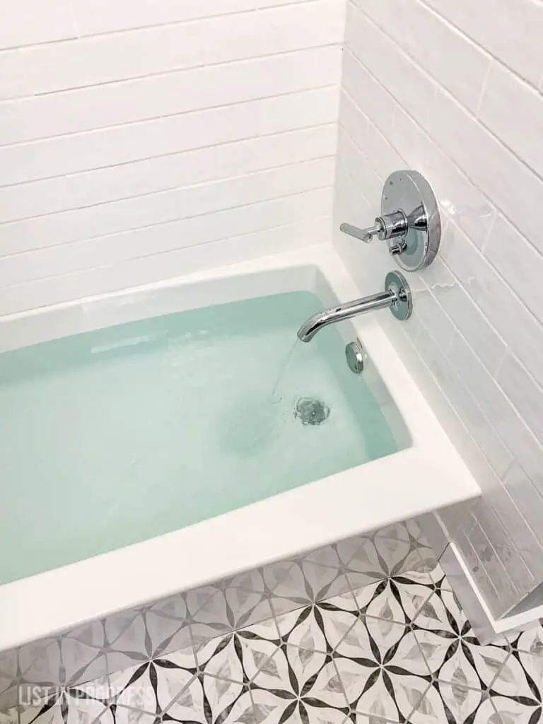
Facing decision fatigue, I copied a patterned hexagon floor tile that my friend had recently installed in her bathroom. She made a great choice! This tile is just perfect; it ties everything together in the bathroom and it echoes the hexagon tile floor at the entry. The grout color is Frost by Mapei (at Lowe’s).
Basement Remodel and a Retro Mini-Fridge
Are you still with me? Great! Here’s a quick tour of the basement, and I’ll show you the amazing, retro mini-fridge that I painted for the bar area.
Here’s the before pic:
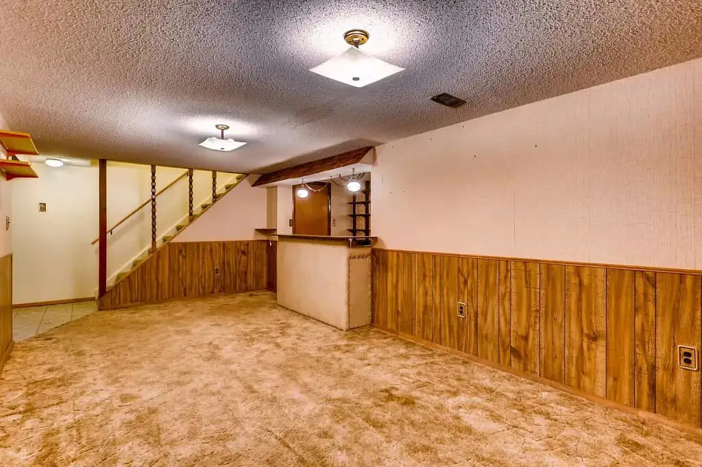
And here’s the after:
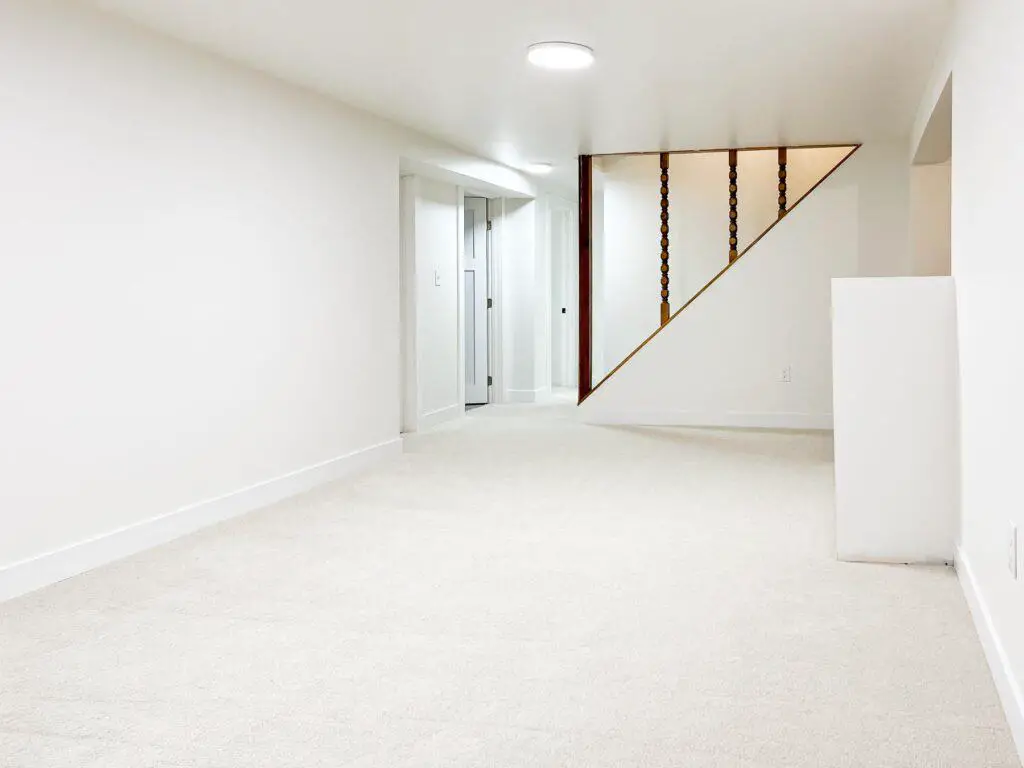
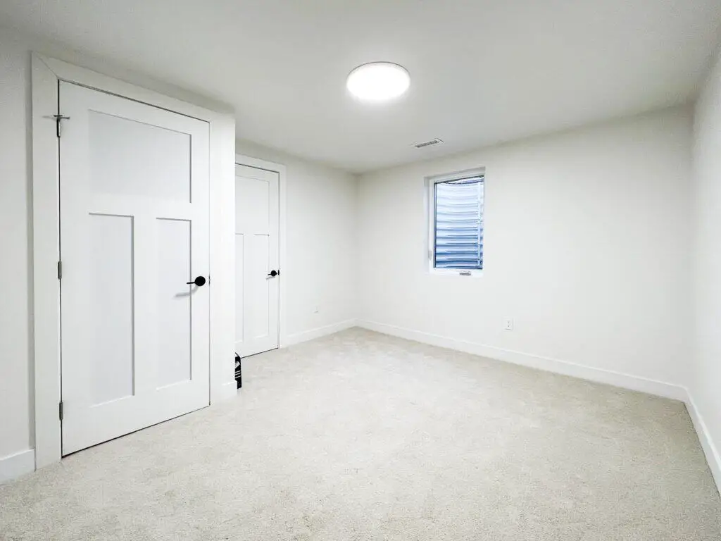
As part of the drywall work, we asked our contractor to scrape the hideous popcorn ceilings and finish the walls to a smooth surface, no texture. That work alone makes such an impact! We added two additional bedrooms in the basement, with egress windows for safety and more natural light. We also painted the walls Silky White and installed a creamy light beige carpet throughout the bedrooms and central space, making this basement a blank canvas for future design choices.
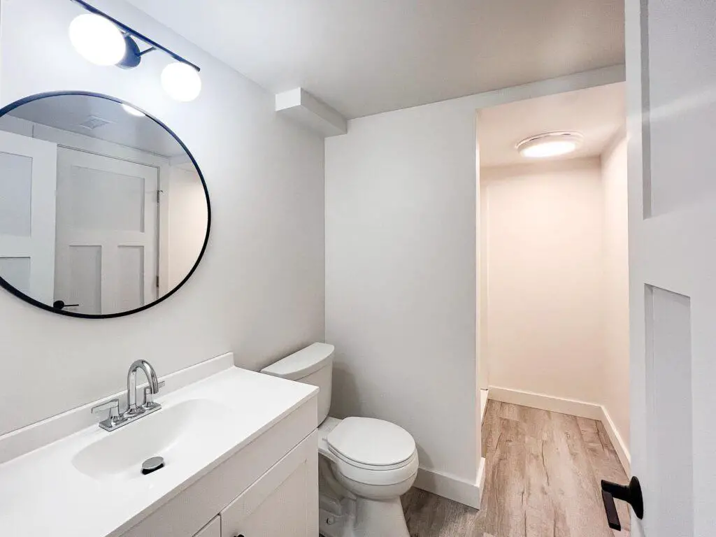
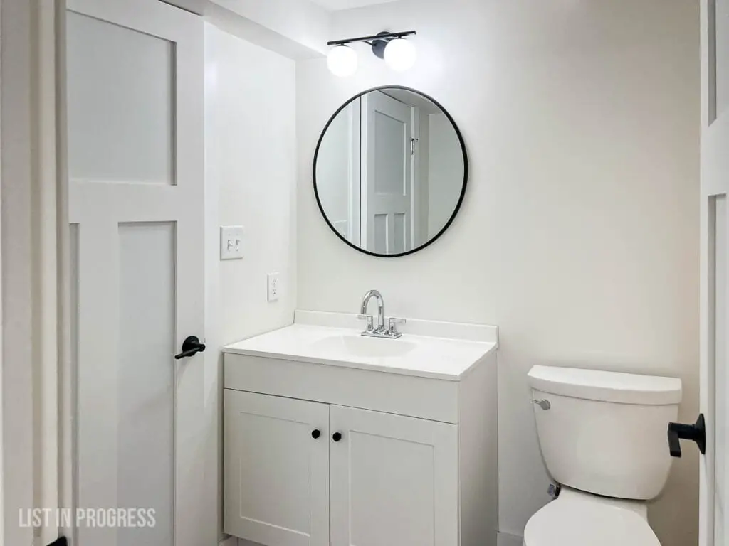
This bathroom was revamped to add a shower and a bath fan, along with a new vanity, flooring, lights, and fixtures. Do you recognize this vinyl plank floor? It’s the same as upstairs, and I installed it in the basement bar as well.
Building a Retro Bar in a Modern Space
Here’s the best part of the basement: the revamped bar nook. Gone is the 1980’s mirrored wall, chain-pendant lights, and wood-shingled faux roof. We kept the footprint the same but updated everything with paint, new flooring, and a new butcher block countertop. There’s a little sink in the corner, too, but I took this shot before it was installed.
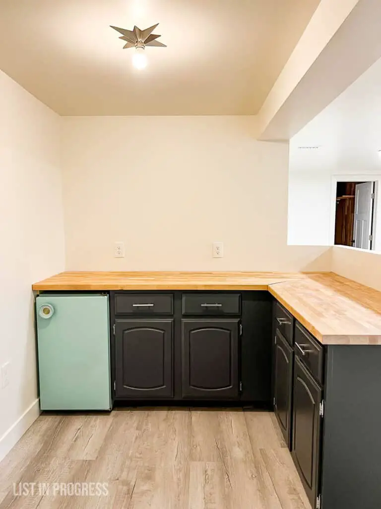
I painted the original base cabinets in Queenstown Gray from General Finishes with GF Topcoat in satin, added chrome bar pulls, and found this retro-inspired star flush mount light.
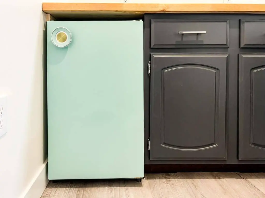
The real star of the show is this mini-fridge! I painted it aqua and even carefully painted the original handle, because that’s what gives it style! I’ll write a future post on how to do this, step by step. Here’s a spoiler: the secret is buying a really good primer. The paint color is Benjamin Moore Hazy Blue.
That’s a wrap on the blonde brick house! It took us a solid 5 years to complete the work, but we loved living there while we did. I hope you enjoyed the tour!
SOURCES
If you jumped straight to this section, buckle up. Here are all of the products and sources featured in our blond brick house. Please let me know if I’ve missed anything that you’re curious about!
Overall
Wall paint – Behr Silky White in eggshell finish
Trim/door paint – Behr Ultra Pure White in semi-gloss
Ceiling paint – Benjamin Moore waterborne ceiling paint
Hardwood floors – refinished with StreetShoe by Basic Coatings in satin finish
Interior doors – primed 3-panel solid wood doors (similar)
Door Hardware – Schlage Latitude lever in matte black
> Click Here for Our Door Trim Project
> Click Here for the Basket Wall Tutorial
> All My Painting Tips and Tricks
Entry
Light fixture – Moravian star light
Flooring – groutable vinyl hex tile
> Click Here for Front Door Project
> Click Here for Groutable Vinyl Tile Project
Kitchen
Cabinet paint – General Finishes Milk Paint in Seagull Gray, GF Topcoat in satin
(also Benjamin Moore Advance, custom color to match Seagull Gray)
Cabinet Hardware – Top Knobs square bar pull in flat black, Pottery Barn Modera black knobs
Backsplash tile – Daltile 3 x 12 glossy textured tile
Backsplash grout – Mapei Avalanche sanded
Countertop – Pental Quartz in Lattice
Floor tile – slate-look porcelain tile (similar or similar)
Floor grout – Polyblend Pewter sanded
> Click Here for DIY Cabinet Project Sources
> The Best Paint for Kitchen Cabinets
> 2022 Cabinet Hardware Trends
Laundry Room
Utility sink – Alape bucket sink, gray trim
Faucet – Kohler Purist wall mount, chrome
Shelves – Acacia 24″ shelves
Family Room
Door paint color – Benjamin Moore Cloudy Sky
Back door hardware – Schlage Bowery knob/Greyson rose, Schlage deadbolt
LVP flooring – Style Selections in Charleston Oak
Flush mount lights – Duncan by Golden Lighting, gloss white with black trim
Bedrooms
Blinds – SelectBlinds blackout cellular in white satin
Bifold closet doors – primed, hollow-core doors
Closet door knobs – Pottery Barn Modera black knobs
Sliding glass closet door – Renin Euro 1-lite (often available on Wayfair)
Main Bathroom
Wall paint – Sherwin Williams Krypton in eggshell
Vanity – existing, painted in General Finishes Milk Paint in Lamp Black, GF Topcoat in flat finish
Vanity hardware – Pottery Barn Modera black knobs, silver loops (no longer available)
Light fixture – vanity 3-light chrome
Sink vanity top – Glacier Bay white 49″ countertop
Sink faucet – Kohler 3-hole chrome faucet
TP holder – Pottery Barn Harley line
Bathtub – Kohler Elmbrook alcove tub
Shower tile – Daltile 3 x 12 glossy textured tile
Shower grout – Mapei Avalanche sanded grout
Floor tile – Merola hexagon porcelain tile
Floor grout – Mapei Frost sanded
> Click Here for Simple Hanging Shelves
> Click Here for Mirror Frame DIY
En Suite Bathroom
Glass shower door – 48″ wide door in matte black
Shower tile – Daltile 3 x 12 glossy textured tile
Grout – Mapei Avalanche sanded grout
Shower trim kit – Delta Trinsic in chrome
Floor tile – Merola matte black penny tile
Floor grout – Mapei black sanded
Shower curb – Whole Tiles 6 x 48″ granite, absolute black
Vanity light – black and chrome light (similar but all black)
Mirror – 24″ x 30″ rounded rectangle, black
Vanity – IKEA Godmorgan base + Odensvik sink
Sink faucet – Delta Trinsic single hole, chrome
Drawer fronts – Semihandmade, walnut
Drawer hardware – 5″ black pulls
Basement
Bar nook cabinet paint – General Finishes Queenstown Gray, Topcoat in satin
Cabinet hardware – chrome bar pulls
Bar Light fixture – star flush mount
Bar flooring – Style Selections in Charleston Oak
Fridge paint color – Benjamin Moore Hazy Blue
Carpet – remnant from local installer, not sure which line
Light fixtures – 12″ LED flush mount
Basement Bathroom
Vanity – 36″ white vanity with sink top
Sink faucet – Kohler 3-hole chrome faucet
Mirror – 32″ round black mirror
Vanity light – black 2-globe light
Flooring – Style Selections in Charleston Oak
Bath light/fan – Broan LED exhaust fan
Shower kit – Sterling base + walls set
Au Revoir to our Mid-Century, Blonde Brick House!
